Design Challenge
Redesign up to two core flows of the YouTube app experience you feel can be improved and propose a new direction for it.
Process overview

Inspiration
Intercepts and interviews
I started the redesign process with quick intercepts and interviews. I learned about users’ habits and pain-points of using YouTube. Some of the major pain points interviewees identified were:
1. Advertisements
2. Video suggestion changes if a user goes back
3. Can’t find the watch history
4. Lack of control on video (repeat play, rewind, etc.)
5. Problem scrolling “up next” videos and comments
Survey
A survey was conducted to gather more information on users’ pain points with the current app and how they browse around the app. Three questions were asked. 20 people responded to the survey.
I asked: on a scale of 1 to 5, what do you most likely do first when you open the YouTube mobile app? (1 for what you do least, 5 being the most)

Users responded as follows:
Search: 4.2
Subscription: 3.00
Home: 2.85
Library: 2.3
Trending: 2.15
Activity: 2.1
Upload: 1.35
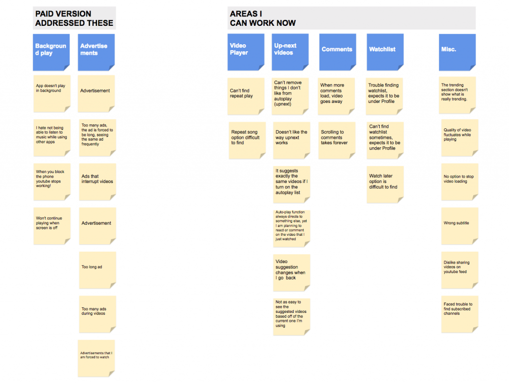
Affinity Diagram
Based on the intercepts, interviews, and surveys- an affinity diagram was developed to understand the usability pattern.
Secondary Research
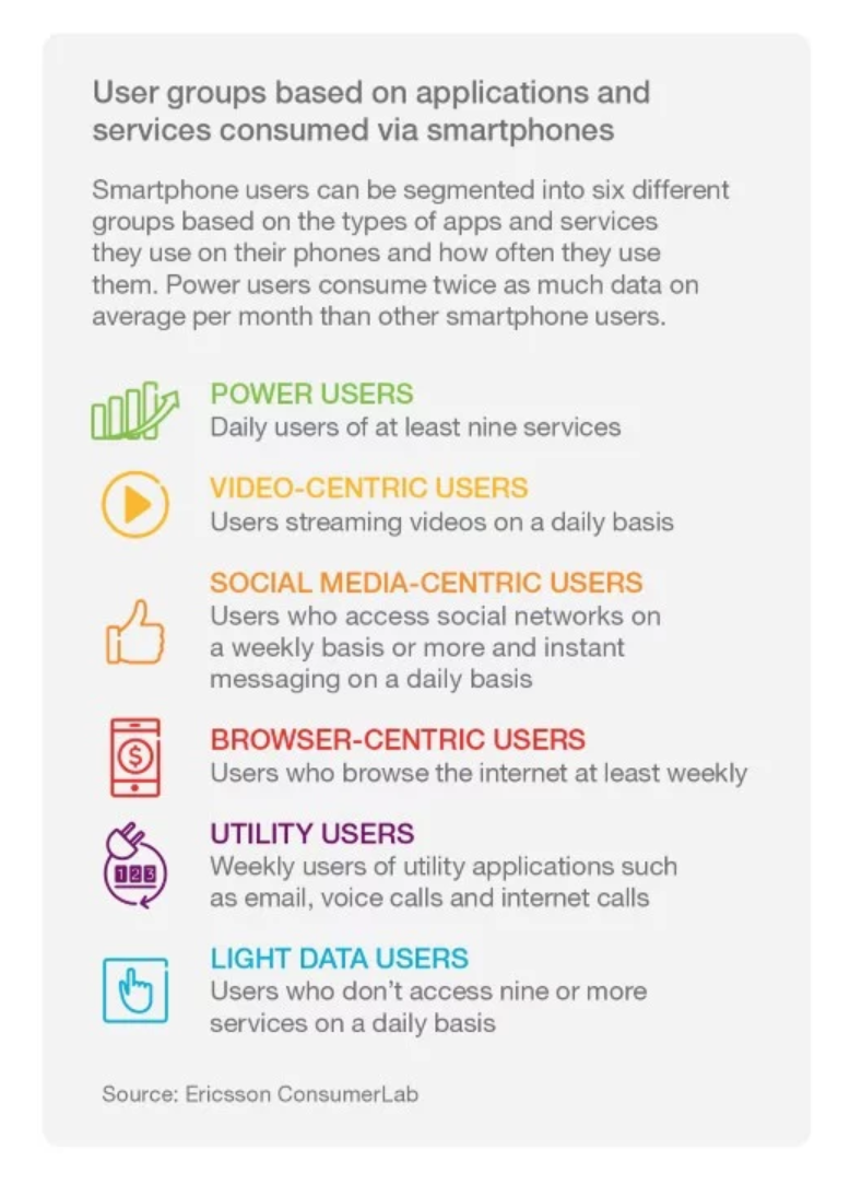
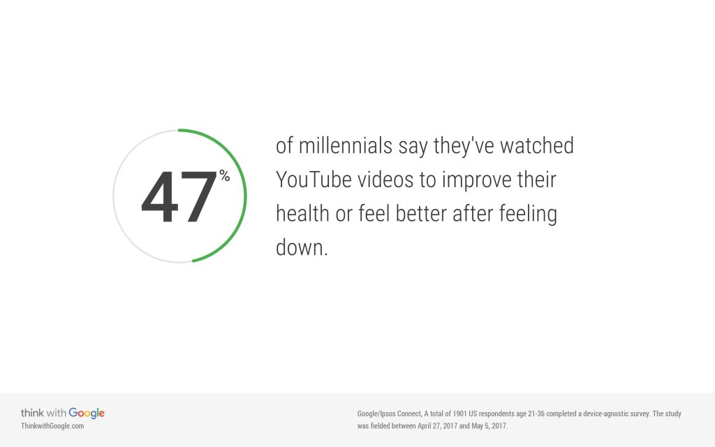
At this stage, I conducted secondary research to have a deeper understanding of the usage of YouTube and how the user behaviors are changing in video consuming. Some of the findings are mentioned below.
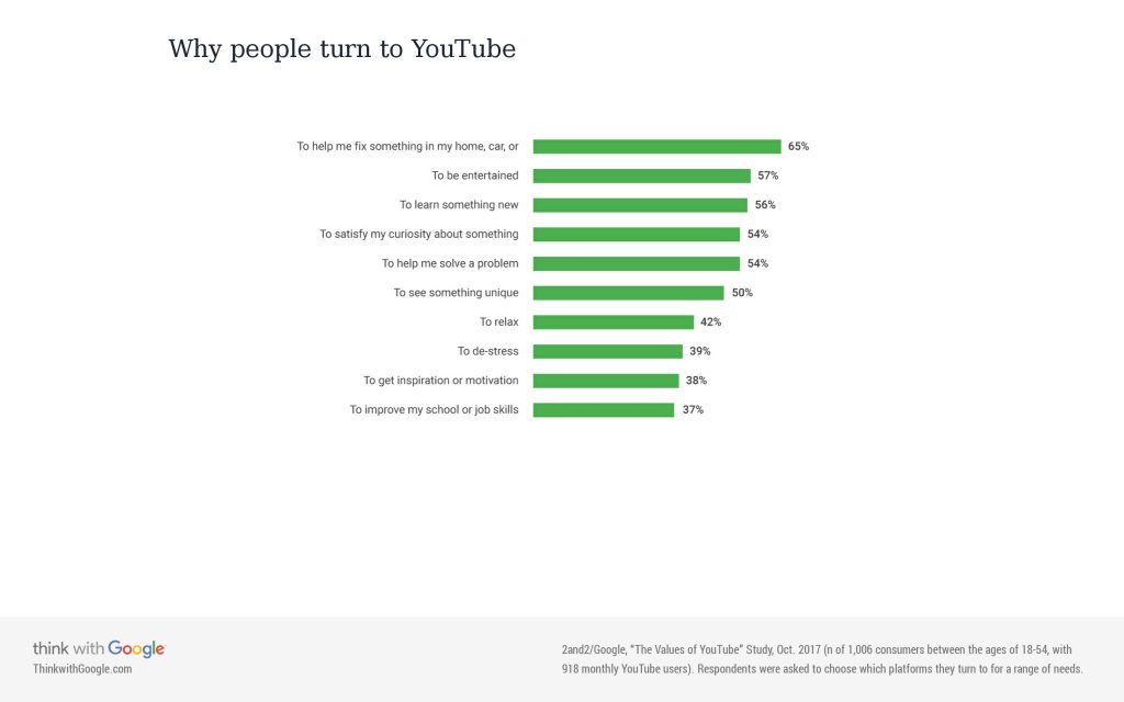
"Our recommendation algorithms keep getting better, we’re now seeing more browsing than searching behavior. People are choosing to do less work and let us serve them."
[5 questions for YouTube’s lead UX researcher, cited: March 2018, source link]
"Mobile video traffic is forecast to grow by around 50 percent annually through 2022 to account for nearly 3 quarters of all mobile data traffic."
[Mobile technology trends: traffic by application category, cited: March 2018, source link]
"Consumers are increasingly using live video streaming apps to interact with friends, family and followers."
"YouTube still dominates video traffic in most mobile networks, accounting for between 40–70 percent of total video traffic for almost all measured networks – regardless of terminal type. For smartphones, social networking is the second largest traffic volume contributor, with an average share of 15 percent in measured networks. Video traffic is likely to further increase as new apps with embedded live streaming emerge"
"Around one in five smartphone users in the US expresses an interest in live video broadcast, but there are twice as many smartphone users in high growth markets like India, Indonesia, Brazil and Oman who are interested in such apps. This indicates that, over the next 12 months, there will be a bigger appetite for live video streaming beyond the US."
[The latest social media trend: live streaming, source link]
"Live streaming will continue its explosive rise in popularity. You could make the argument that live streaming dominated 2017; about 80 percent of consumers would rather watch a live video from a brand than read a blog, and 82 percent would prefer live video to written social media updates."
[7 Social Media Trends That Will Dominate 2018, cited: March 2018, source link]
There have been a lot of controversy with YouTube content as well. Some news sources published articles on how YouTube failed to acknowledge these problems.
"Jonathan Albright, research director for the Tow Center for Digital Journalism at Columbia University, has studied misinformation on YouTube going back to the 2016 presidential election. But even he was surprised by what he found after mapping out the videos that YouTube suggested alongside videos alleging conspiracies connected to the shooting at Marjory Stoneman Douglas High School."
[YouTube's conspiracy video problem is just getting worse, researcher says, cited: March 2018, source link]
"YouTube has been routinely made aware of disturbing content by the media, acting only after it starts to generate bad headlines. At its core, YouTube has a content policing problem. "
[YouTube has to start watching what its biggest creators are doing, cited: March 2018, source link]
Competitive Research
Based on the research done until this point, I figured which mobile platforms can be YouTube’s current and future threats and competitions. Some of the mobile apps that I looked into were Facebook, Instagram, Vimeo, and Snapchat. Though except Vimeo none of them are primarily video sharing platforms, they are bringing ideas that include live and recorded video sharing. According to my findings in secondary research, live videos are getting popular fast and if YouTube fails to prove itself as a viable medium of sharing live videos- it may start losing some users or attracting new users, especially millennials. The social aspect of these apps is also something YouTube does not have very strongly right now.


IDEATION
Proto-Personas

Jessie Brown
21 years old, College student
Loves music and DIY crafting projects. Often listens to music continuously and work/study. Saves interesting DIY videos when she finds some interesting. Often needs to go browsing history or saved playlist to find a particular DIY tutorial found before.

Josh Morehouse
32 years old, IT professional and vlogger
Josh has a passion for tech. Besides his IT job, he also runs a vlog where he talks about latest tech and gadgets. He loves staying in touch with his subscribers/followers and is very active on social media. He covers tech events live. He also does a weekly live streaming as that helps him get more followers and interact with them instantly.
Design Principles
The overall approach for the redesign was to make the experience better without radically changing an already popular and familiar platform. Key principles were:
- Making YouTube ready for changing behavior of the users and catching up with the trend.
- Improving user experience by removing frustrations in user journey and adding delightful micro-interactions.
- Help users find what they are looking for and help them discover new interests.
- Help users engage more with the content and have a better social experience.
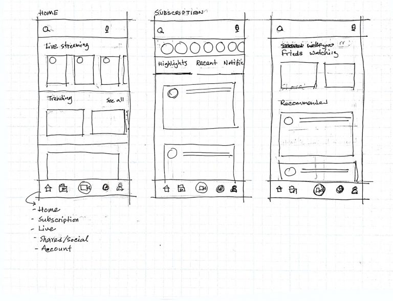
Sketches
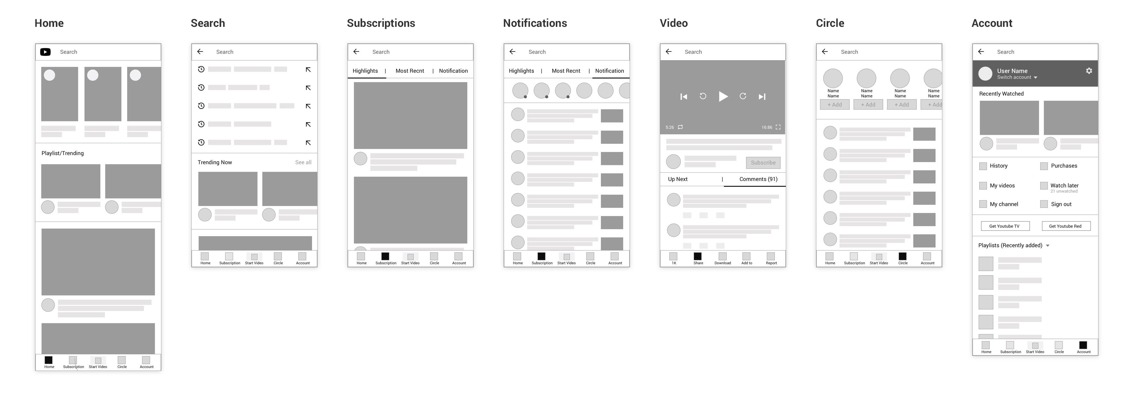
WIreframes
Implementation
UI Design
Prototype
Key changes and rationale:
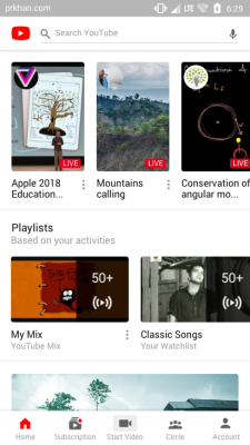
- YouTube is the second largest search engine in the world. My research suggests 82% of the users start browsing YouTube with a search. Hence a bigger bolder search bar is introduced in the header that is available on all screens except when a video is played. Interestingly, by the time I finished the project, YouTube has pushed an update where the search bar is made more prominent.
- Researchers show that live video trend is on the rise. Hence a prominent placement of the live video on the homepage which is horizontally scrollable.
- YouTube lead UX researcher mentioned how YouTube had got smarter in suggesting what to watch. The current app suggests a vertical list of YouTube Mix only. I suggest such lists to be horizontal for more effective use of the real estate that is visible without scrolling. I also suggest a list of Playlists that includes both YouTube Mix and user-generated playlists instead of YouTube mix only. Such lists, that may include trending videos and topics, can be placed in between bigger video suggestions and should be prioritized based user behavior and recent activity.
- I have simplified the navigation based on user feedback. Kept only those which users use most often and renamed and merged a few for better understanding. A prominent “Start video” icon is placed to encourage users to create more content and start a live streaming as the market for live streaming is rapidly increasing. Focusing on live videos can be crucial for YouTube in coming days and this, along with more social engagement, should be YouTube’s new direction.
- The overall look of the UI is kept very similar to the existing one for brand consistency. However, subtle rounded corners are introduced for a much modern feel and to complement the rise of mobile screens with rounded corners which effectively make the video in full screen rounded.
Key changes and rationale:
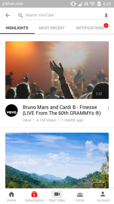
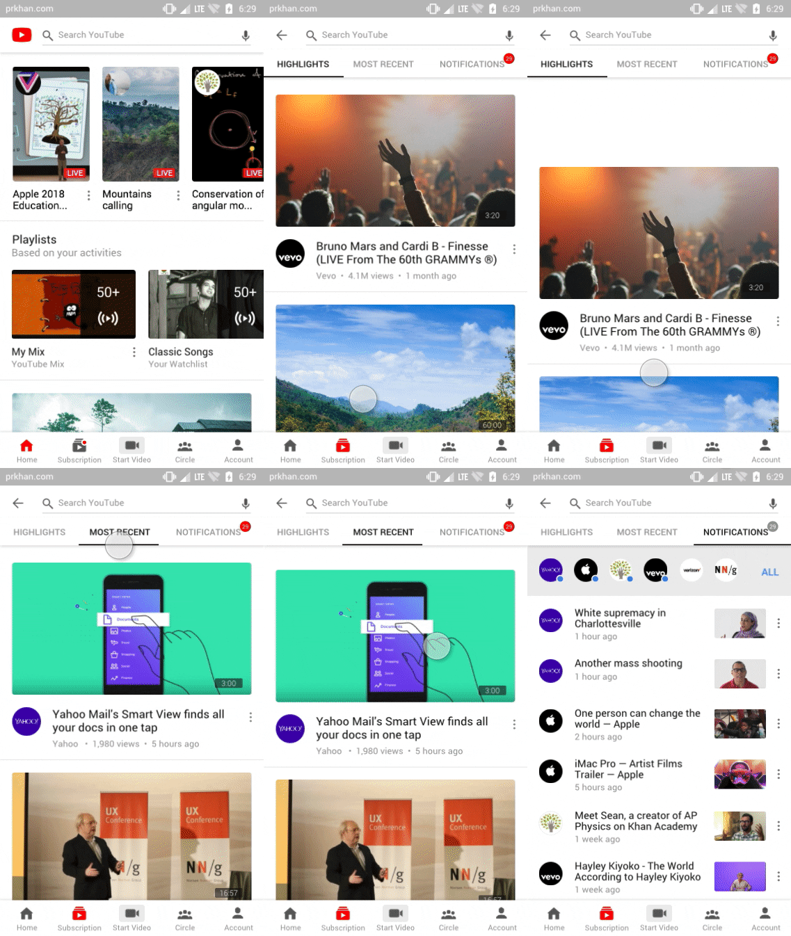
- Tabbed navigation is introduced in place of a drop-down menu. The navigation sticks to the top to make it easy for the user to see and browse through all the filter options.
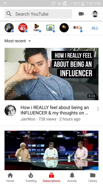
- Notification is moved under Subscription. Originally it was under Activity section which makes no sense to me. Though might seem minor, this is my biggest criticism of the current YouTube app. The notification is full of updates from the subscribed pages, so it only feels relatable under the Subscription section. Later in the usability testing, I found users could never find notifications in the existing app, but they were able to find it in the proposed design.
- Micro-interactions were improved.
Key changes and rationale:
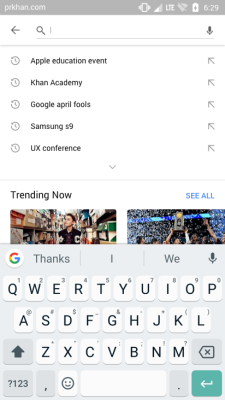
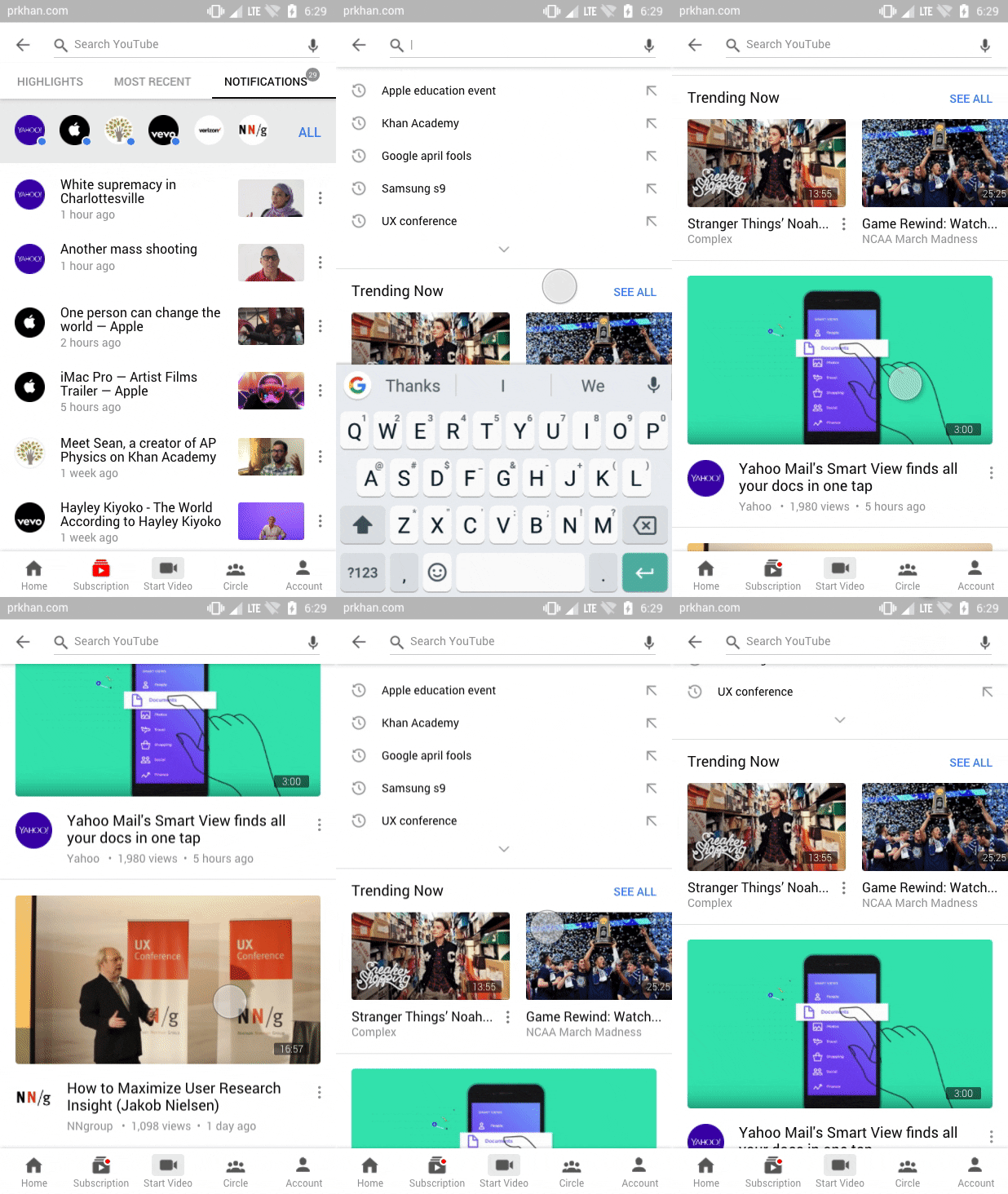
- Current search page offers nothing to discover to the users though it is the most preferred entry point for the users. Trending videos were removed from the main navigation in my design since I didn’t find much proof of users being interested in this. However, along with other video suggestions, trending video suggestions can be added on the search page since users are already in a discovering mindset at this stage and more likely to be receptive to suggestions that may not fit their regular interests. According to my survey, 70% of the users agreed that video suggestions on the search page would be useful to them.
Key changes and rationale:
- Mobile’s status bar removed for extra real-estate.
- Subscribe button made more prominent which is also visually similar to the desktop version.
- Engagement made easy with tabbed navigation to switch between “up next” and “comments”. Immediate visibility of comment section and the sticky comment box will encourage users to participate.
- Interaction with the content made easy and always available by placing them on a sticky footer. Dislike option is removed, both for the video and the comment, to help maintain a positive vibe in the community. However, a prominent report button is added to the video, which was previously hidden, to combat harmful content and empower users.
- New options added for video control. Current app has a double tap gesture for forwarding or rewinding by 10 seconds, but I found many users are not aware of that as it has no signifier. So, two additional control buttons added to forward or rewind the video. A repeat play button is also added because I found users want that. Repeat play or loop is available on the desktop version of YouTube but that is actually hidden. On mobile, I didn’t find any way to play a video on loop.
- Micro-animation added to the like button for added delight to the users and potentially encourage more to interact with the content.
Key changes and rationale:
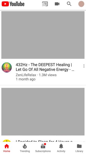
- During my research, I found the title “activity” creates a huge confusion among users. It often makes users think “history” and such things are here whereas it is a place where users can see their sharing activities within YouTube platform. To avoid such confusion, I propose to rename it as “circle”, or something that more clearly indicates in this section users can directly interact with the contacts they added. Google Plus failed, but with more research, this place on YouTube can be Google’s answer to social media and messaging platforms.
- Besides making the page less cluttered and more organized, I added two new sections where users can see what they have shared with their contacts and what other people in the network are watching. The latter will potentially help users discover more contents that they might be interested in. However, users are not able to see who is watching what which may raise a privacy concern. In future, to promote more sharing, this can be a place where users can see what other people have shared on their “wall”, similar to Tumblr’s share feature or Twitter’s retweet feature. More research is needed to do this successfully, but this can be a new direction for YouTube without sacrificing what they already have.
- “Notifications” are removed as it has no relation with the contacts or sharing. As mentioned before, “notifications” are moved under “subscription” because it is most relatable to that section.
Key changes and rationale:
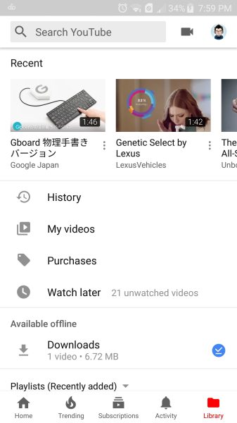
- In the current app, “activity” and “library” seem to be confusing to many users I interviewed. There is also an “account” section. When asked to find watch history, many people tried to find it under “account”, some tried “activity”. I eventually renamed “activity” section to “circle” and merged existing “account” and “library” under one umbrella calling it “account”.
Usability testing
After the prototype, I conducted some usability testing. It gave me some insights on how my changes are performing. However, I want to mention, with more extensive usability testing and iteration, the result could be different and more ideas could come to the table.
Besides collecting general feedback on the redesign, I gave four tasks to the users which they tried to accomplish on both existing app and the redesigned version. The tasks were:
- Find your watch history
- Find notifications
- Play a video on loop
- Forward or rewind a video
Users struggled to find watch history on existing app. They tried multiple options (account, activity) before finding it in “library” section. They found it with ease under “account” in the proposed design.
When asked to find notifications, some didn’t even know this feature exists. They thought it makes more sense under “subscription” section as proposed in the redesign.
Nobody was able to set a video on repeat play or loop in the current app. One mentioned she saw the feature but didn’t know where it was. Users easily found the loop control on the redesigned app.
100% of the users I tested with didn’t know how to fast forward or rewind a video in the current app without using the progress bar. Using progress bar was difficult for going back or forward for fraction of a minute. Users immediately figured new controls on redesigned app can solve that problem.
Conclusion
There is no doubt that the team behind the YouTube app spent countless hours to make what we see now. They conducted a lot of researches and iterations. They have access to a huge amount of data which tell them how the users behave and what they try to accomplish. The features and how they have been laid out must have the reasoning driven by those research and data. Besides, the company has its own agenda and goals to achieve.
The amount of research that has been done by me within a limited period of time is fairly small compared to what the YouTube team did. So I don’t claim that every decision I have taken to redesign the app is better than what exists now. I absolutely think a lot more research, usability testing, and iterations can be done to improve the YouTube experience; after all, design is a continuous process!


