Back to work
Walmart Tech
B2BMarketplaceDashboard
Enter the password to view this case study.
Walmart’s most-used seller tool was failing its users — metrics were hard to read, urgency was unclear, and most sellers had little awareness of where they stood. Across 3 phases, I redesigned the dashboard to surface clearer data, benchmark standards, and urgency signals. Better awareness led to measurable engagement and performance uplift across the board.
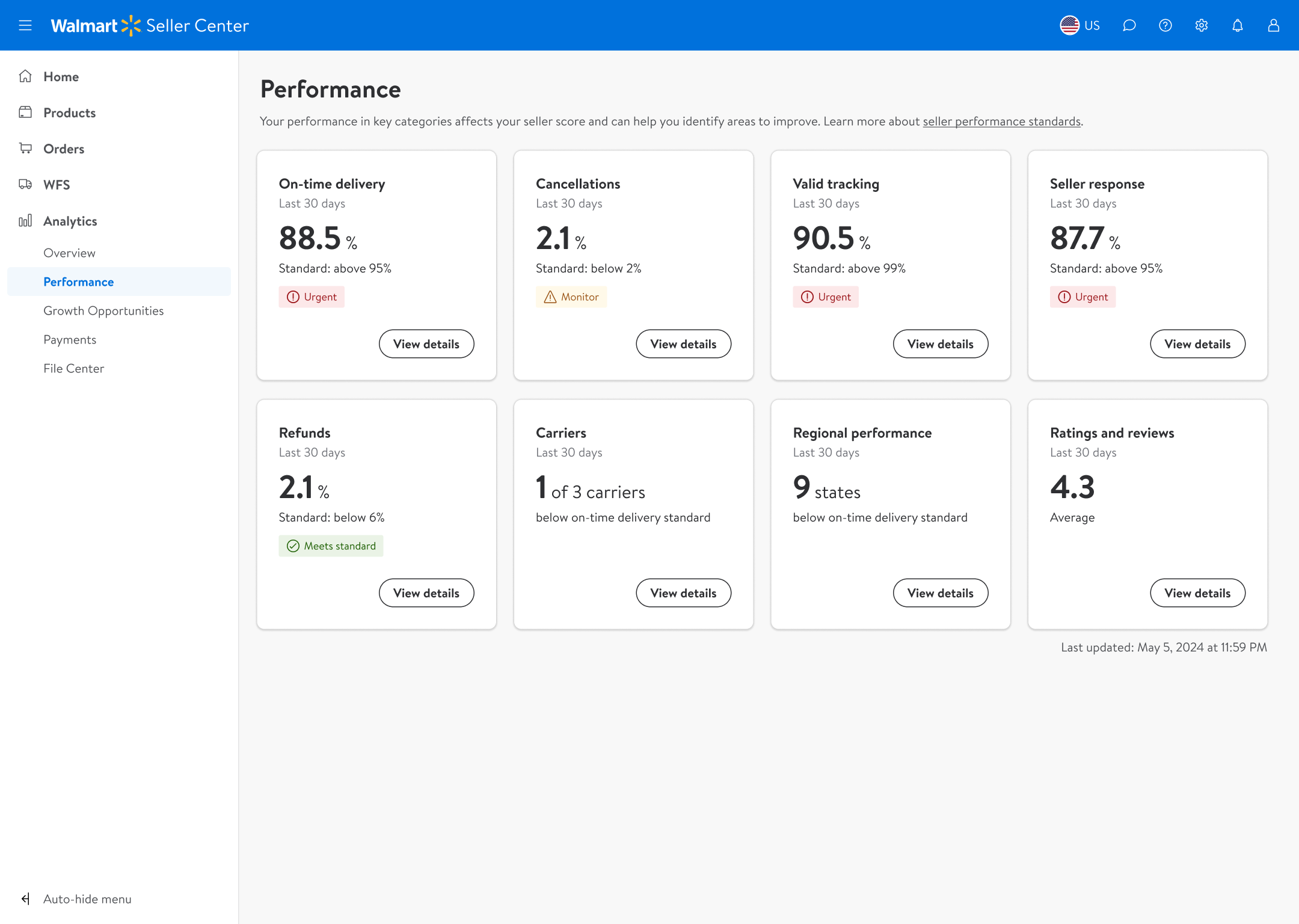
The Seller Performance Dashboard was Walmart Seller Center’s most frequently visited page — yet it was failing its users. Metrics were raw numbers with no context, no urgency indicators, and no benchmark to measure against. High-volume sellers missed optimisation opportunities. New sellers felt overwhelmed and disengaged.
How might we redesign the Seller Performance Dashboard so sellers can instantly understand their standing and know where they need to improve — without a steep learning curve?
Information dense, confusing visuals, too many CTAs
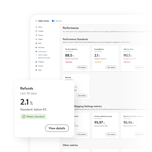
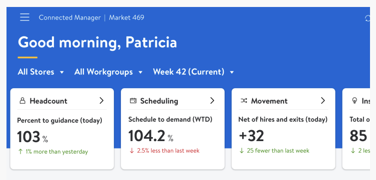
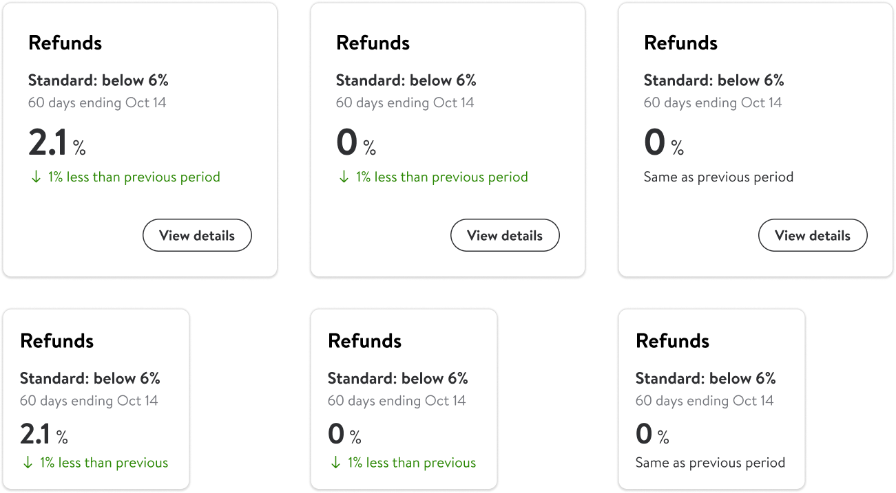
A key finding shaped our entire approach: 6 out of 7 metrics most frequently used by sellers already lived on the Performance Dashboard. The problem wasn’t missing data — it was that sellers couldn’t read what was already there. The solution was to make existing data legible, contextualized, and awareness-building. Based on this, we decided to surface 8 metric tiles — focused and curated around what sellers actually use.
6 of the 7 most-used features lived on the Performance Dashboard
Before designing new components, I audited existing UI patterns across Seller Center. A familiar pattern reduces cognitive load — sellers already know how to read it, so they can focus on the data rather than the interface.
Seller Center UI patterns referenced for familiarity
Seller Center UI patterns referenced for familiarity
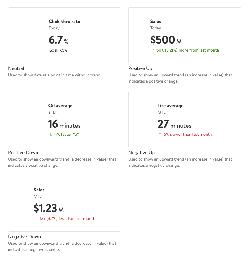
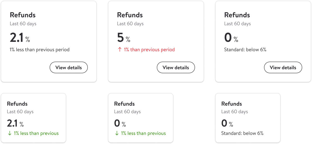
The metric tile was the atomic unit of the dashboard — getting it right was everything. I explored a wide solution space before converging on three proposals to evaluate with stakeholders.
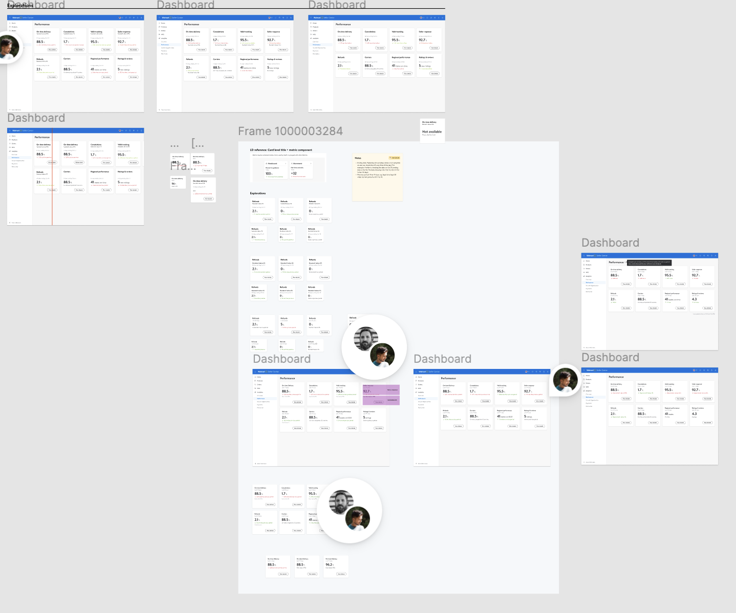
A glimpse into the exploration space — many directions considered before narrowing
Proposal 1
Proposal 2
Proposal 3
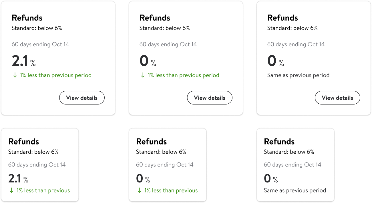
Each proposal addressed the shortcomings of the original tile design — removing the confusing data density, reducing the number of CTAs, and simplifying the visual hierarchy. After socialising with product and business partners, we converged on the approach that surfaced the benchmark standard most clearly, and reinstated an urgency tag system (refined with content designers) to signal how quickly each metric needed attention.
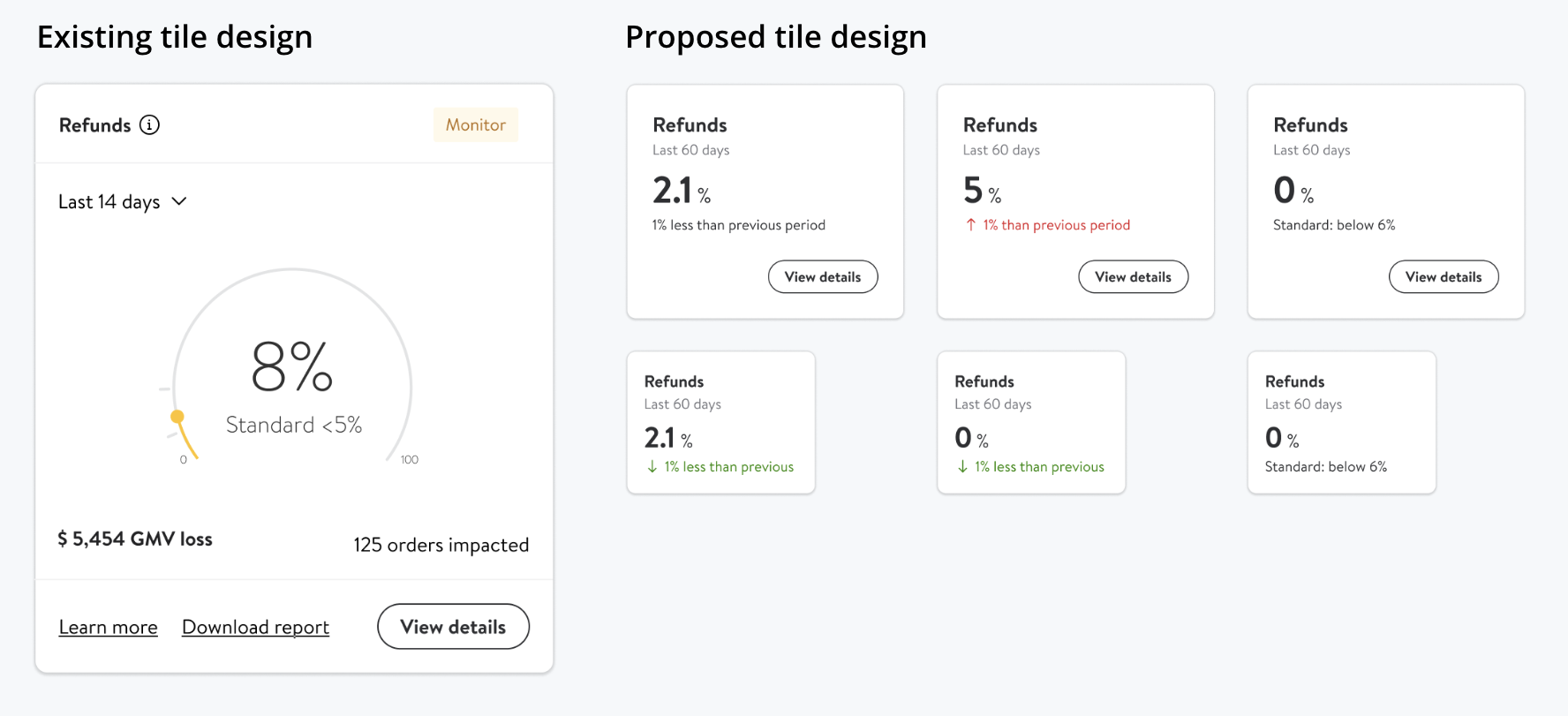
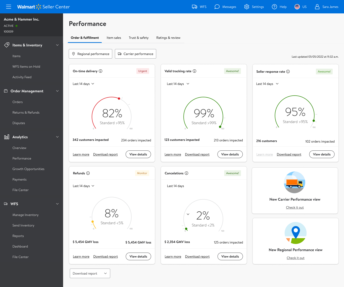
Existing tile design vs initial proposal
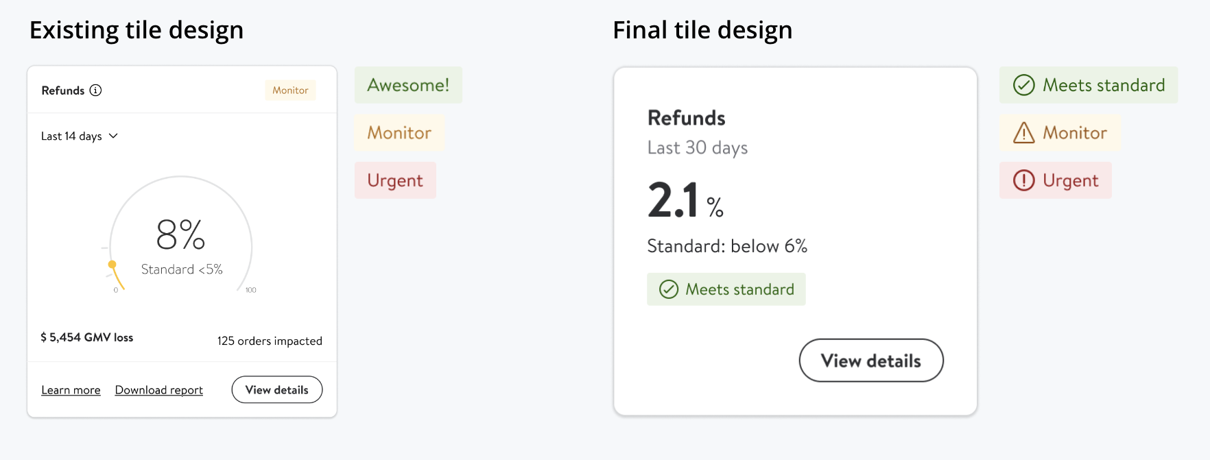
Final tile — benchmark standard + urgency tags
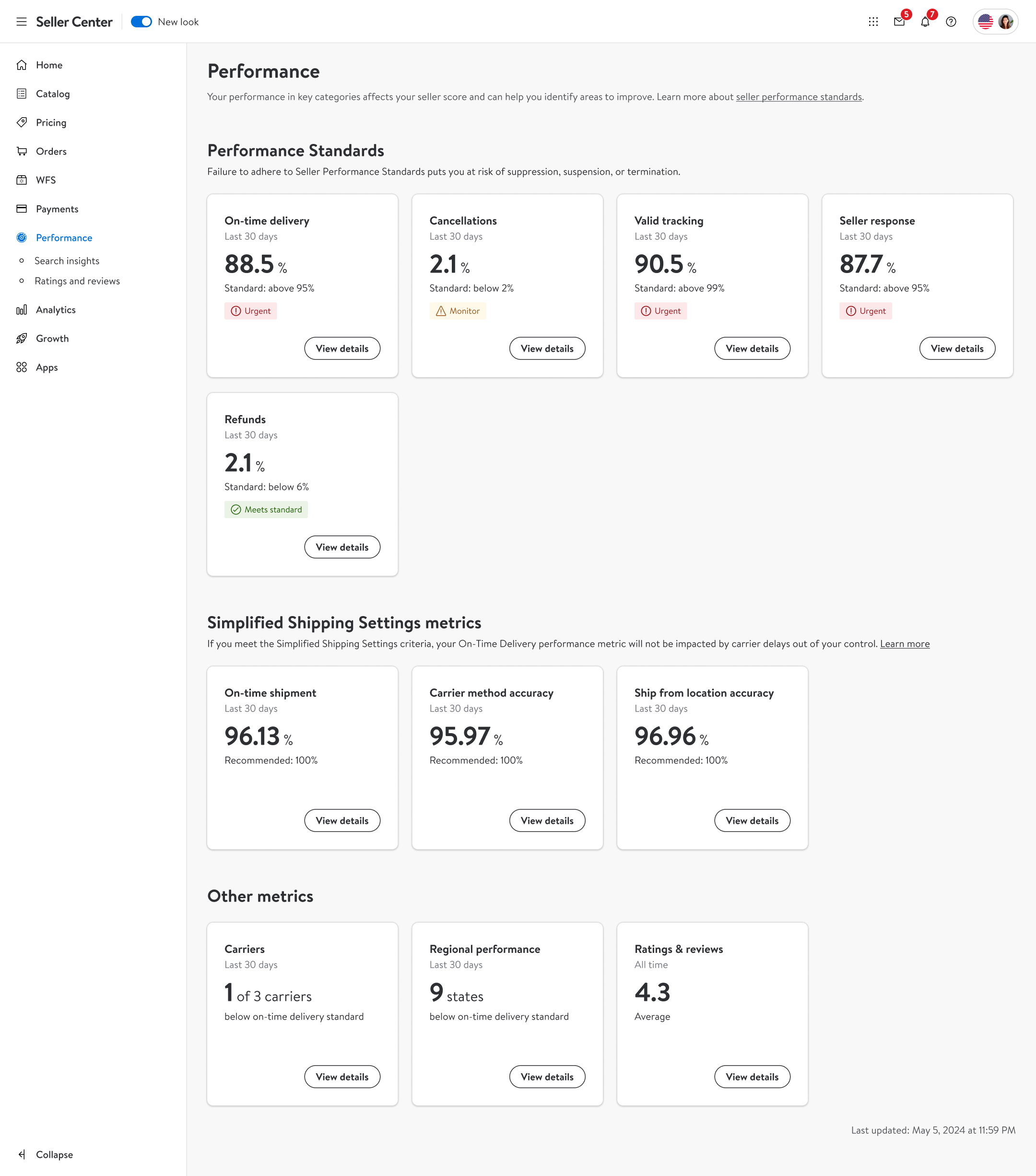
The new dashboard introduced simplified metric tiles with performance benchmarks, urgency tags, and a single focused call-to-action per metric. We also recommended — and implemented — moving “Performance” to Level 1 in the Seller Center navigation, out from under “Analytics” where most sellers couldn’t find it.
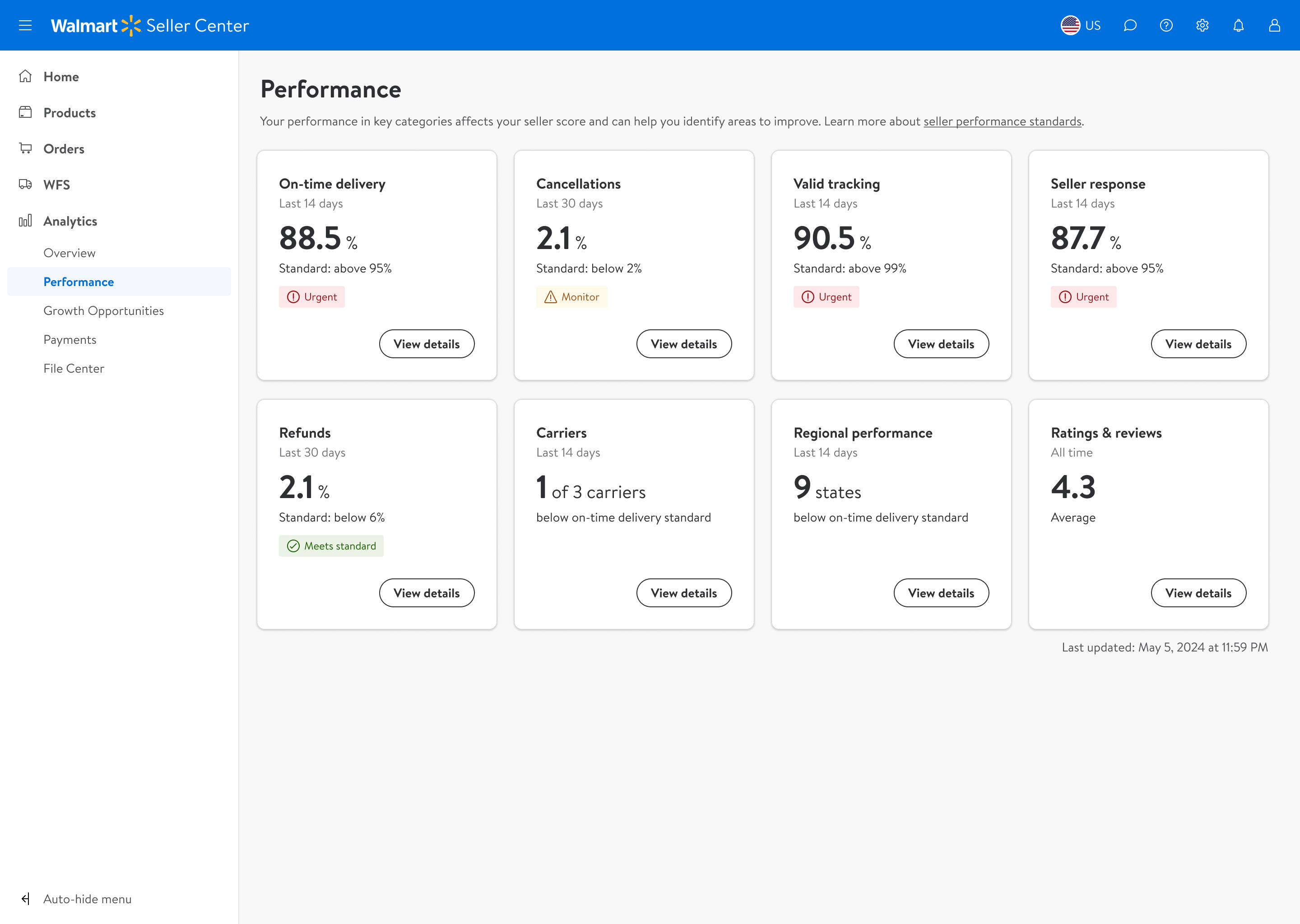
Phase 1 final dashboard — simplified metric tiles, benchmark standards, urgency tags, focused CTAs
Performance was the most-visited area of Seller Center yet buried under “Analytics.” We recommended and implemented elevating it to Level 1 for direct access.
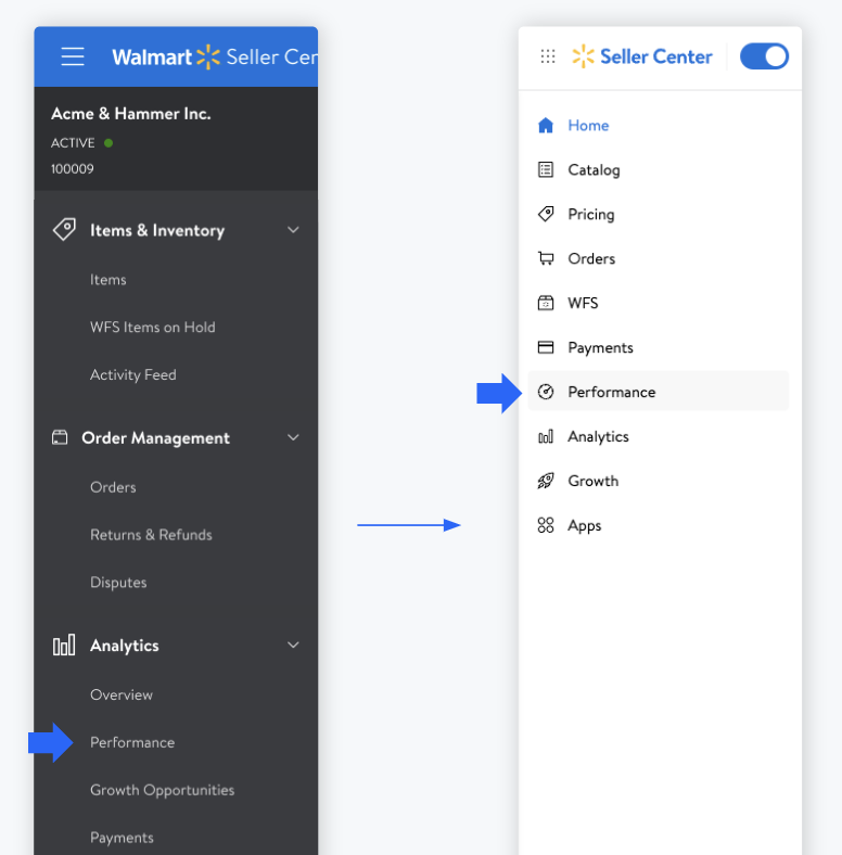
Performance elevated to Level 1 navigation
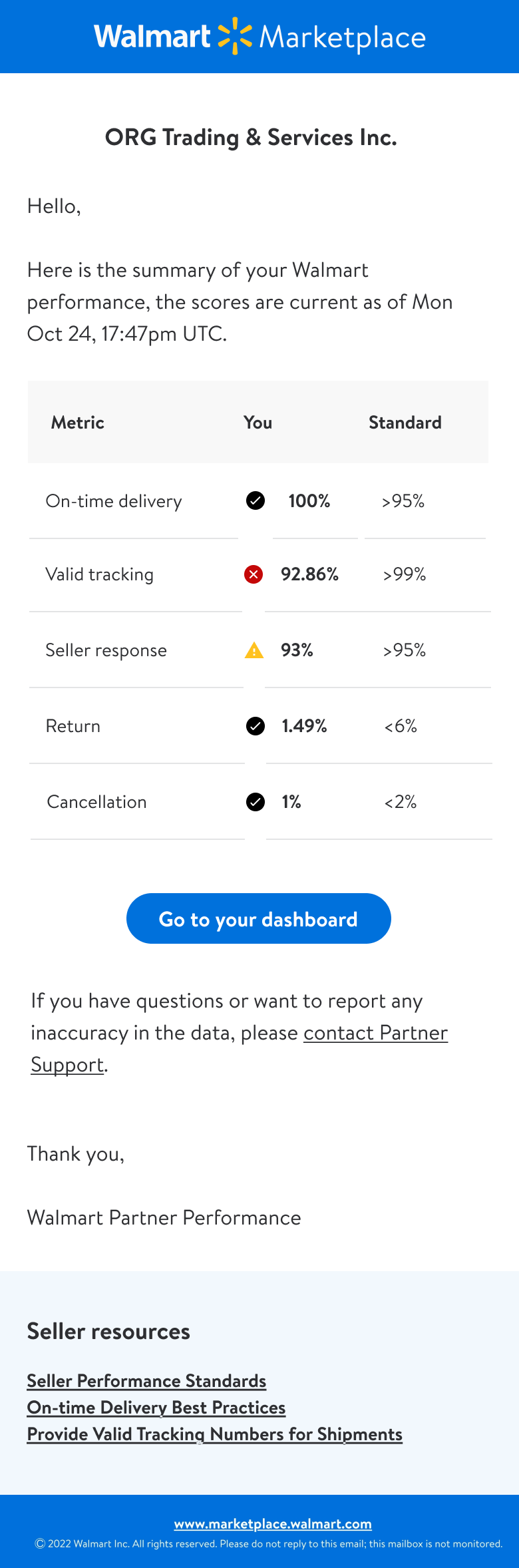
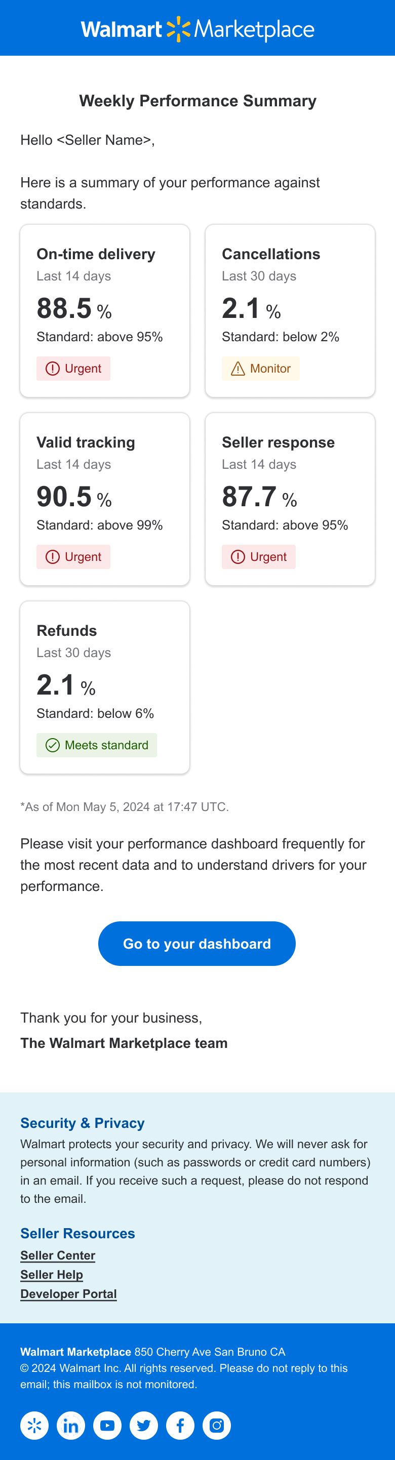
Partnering with the email comms designer, we extended the new tile design into seller emails — ensuring consistent performance data presentation across every touchpoint.
Old Template
New Template
A clear jump in seller activity from July 10, 2024. Some data is redacted due to its sensitive nature.
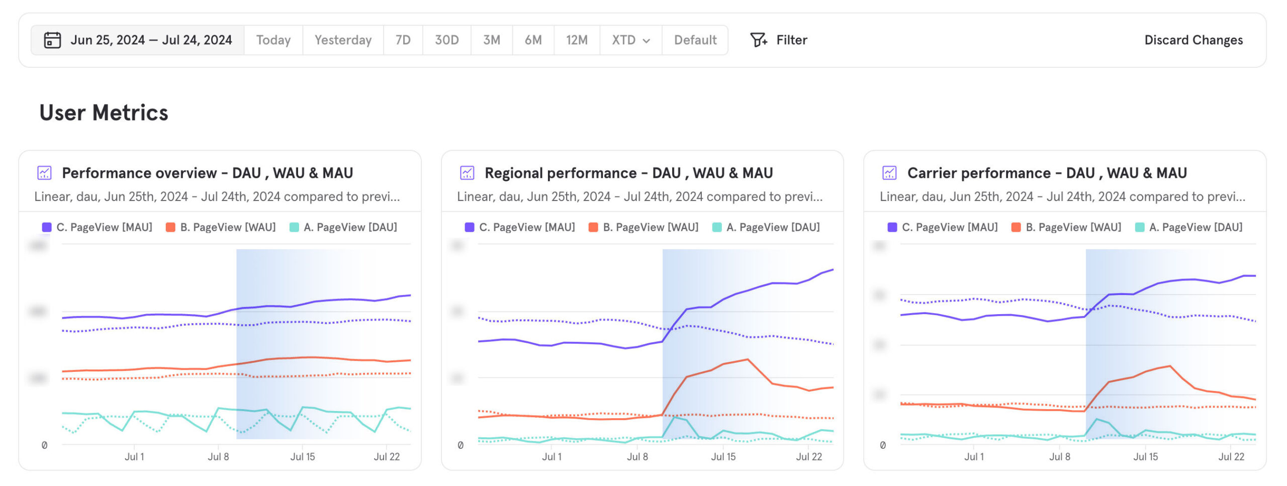
Clear activity jump from launch date — July 10, 2024
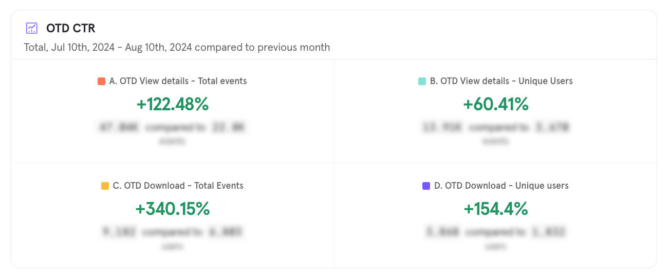
On-time delivery CTR
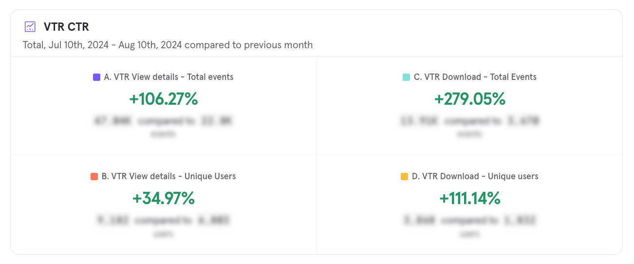
Valid tracking rate CTR
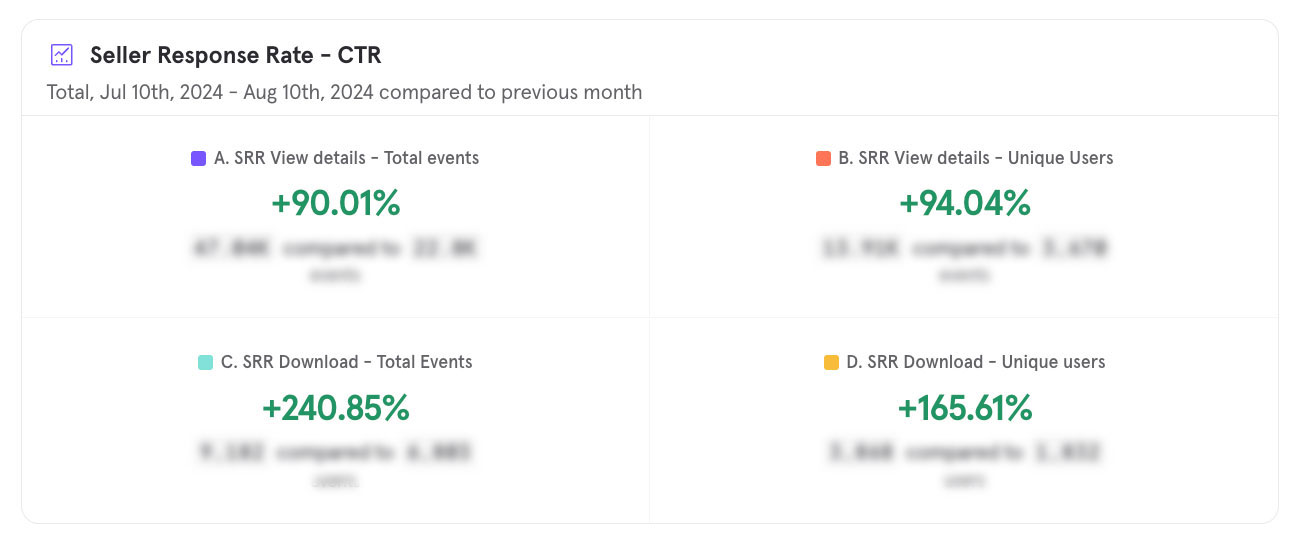
Seller response rate CTR
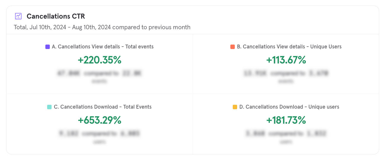
Cancellations CTR
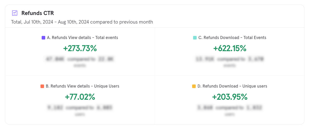
Refunds CTR
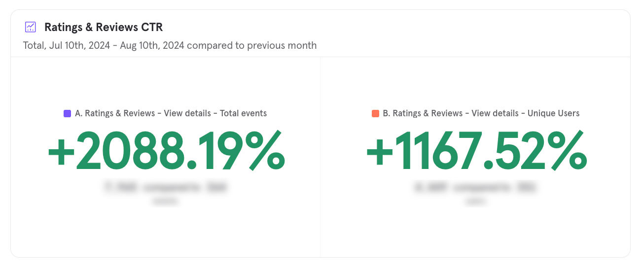
Ratings & reviews CTR
Around 60% of marketplace sellers weren’t being evaluated at all — they didn’t hit the 50-order threshold within the 14-day lookback window. We extended the lookback for OTD, VTR, and SSR from 14 to 30 days, and updated the dashboard and warning communications to match.
Phase 2 — 30-day standard applied across all metrics
Sellers in the Simplified Shipment Settings (SSS) program were being penalised for delivery issues caused by Walmart or the carrier — not themselves. We upgraded the dashboard to surface clearer shipping performance data and introduced a protection system that shields sellers from unfair penalties.
Phase 3 — new sections and SSS-specific metrics introduced
I also designed the “View Details” pages for each SSS metric — giving sellers a deeper look at the specific factors driving their scores, so they could understand exactly where and why performance was flagged.
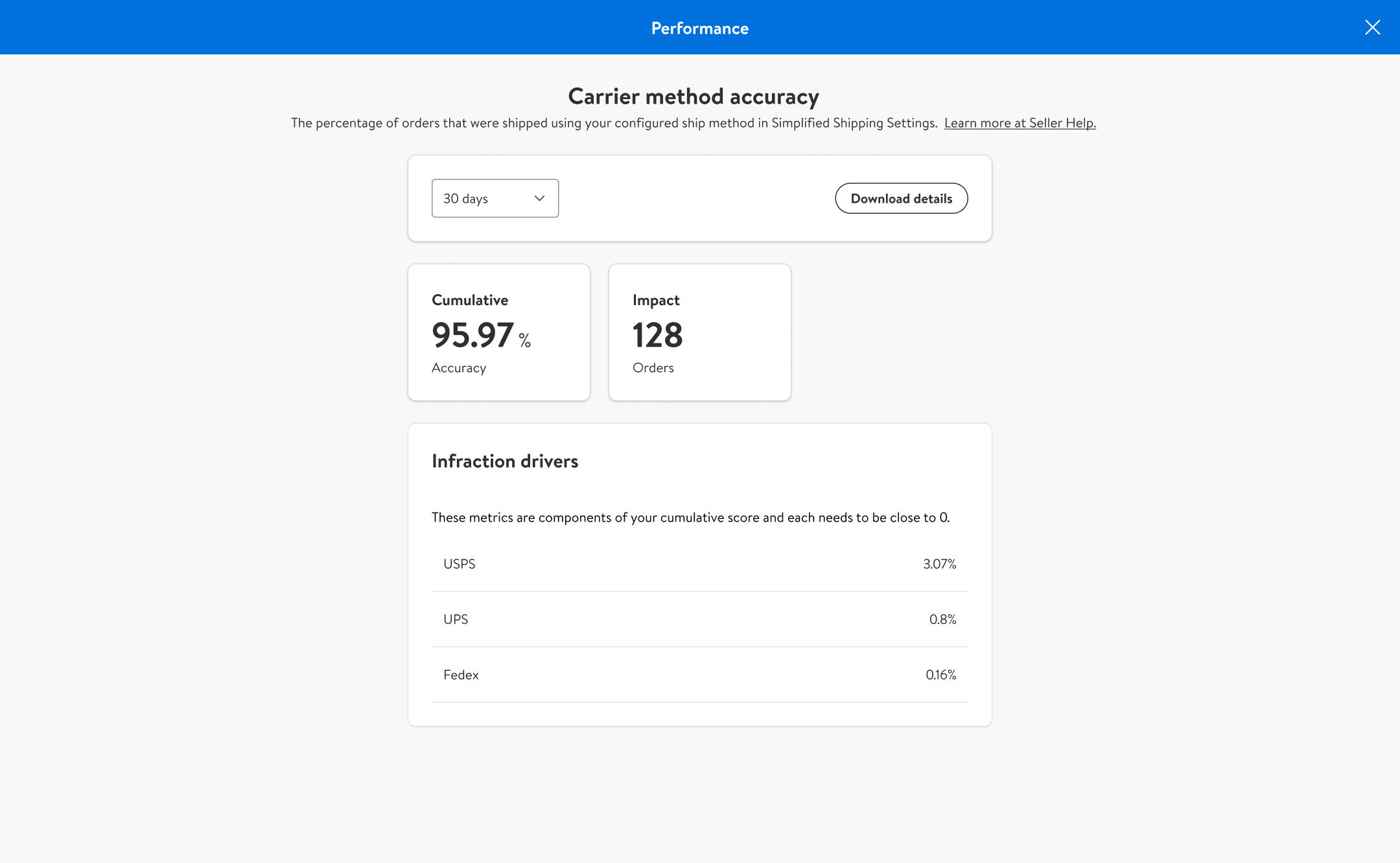
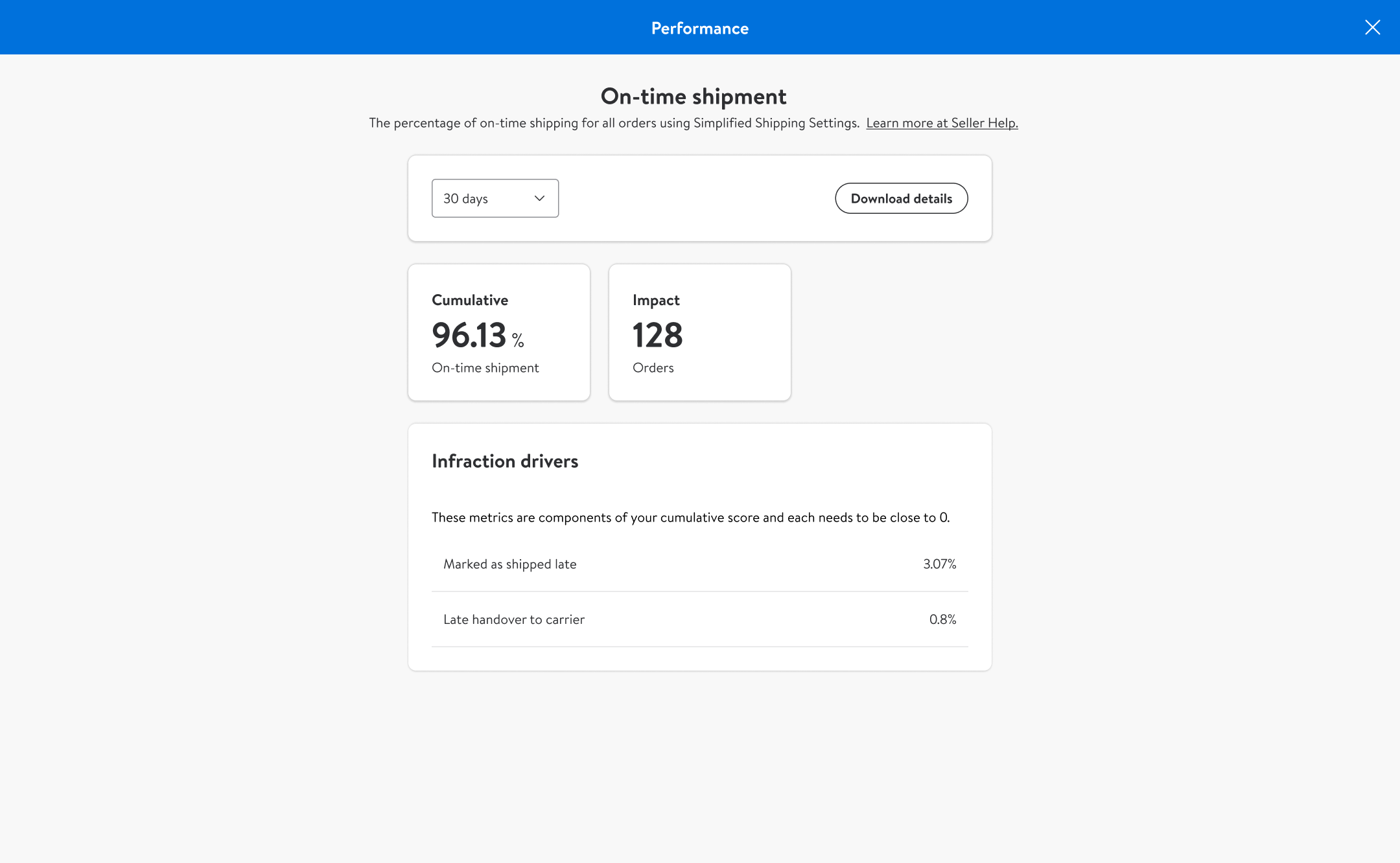
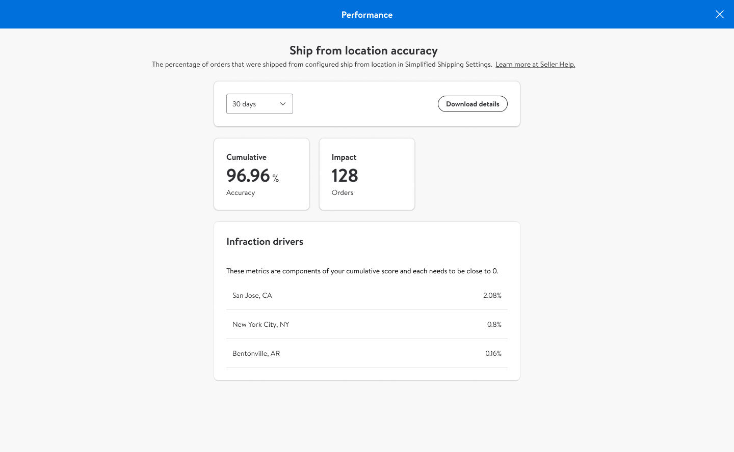
Carrier method accuracy details
I also designed the Regional Performance views — a map-based breakdown showing sellers how their OTD performance varied across different states, color-coded by severity.
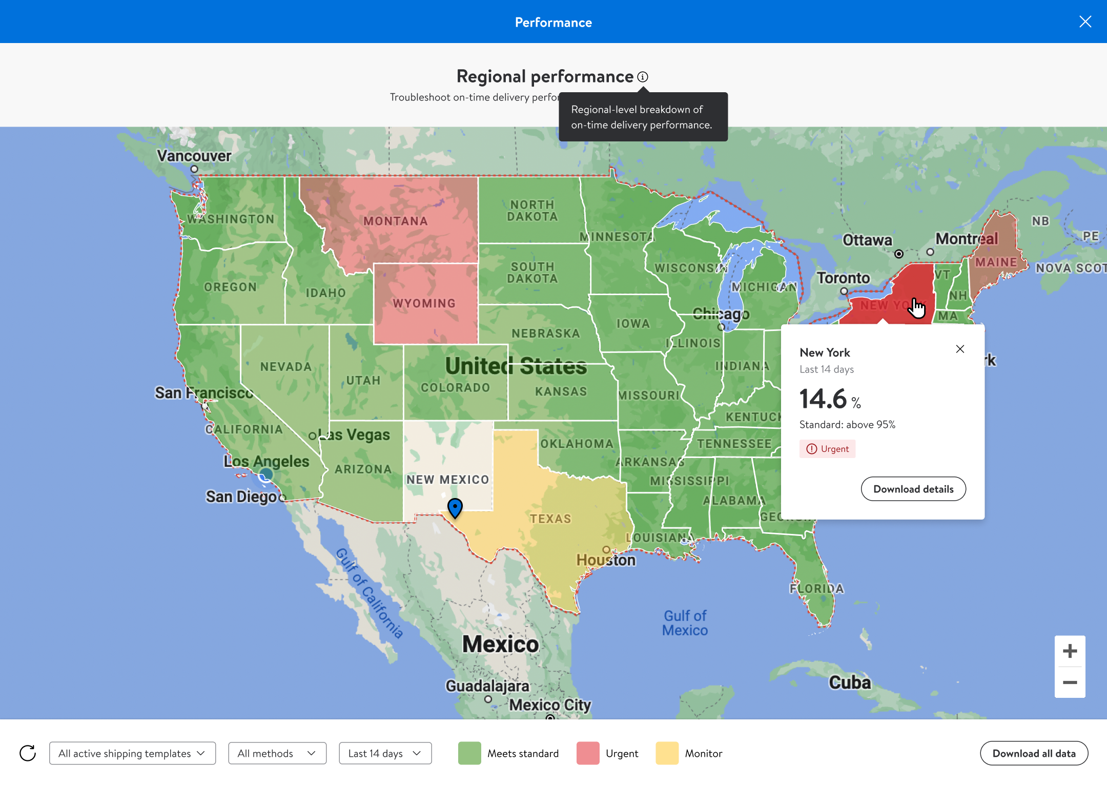
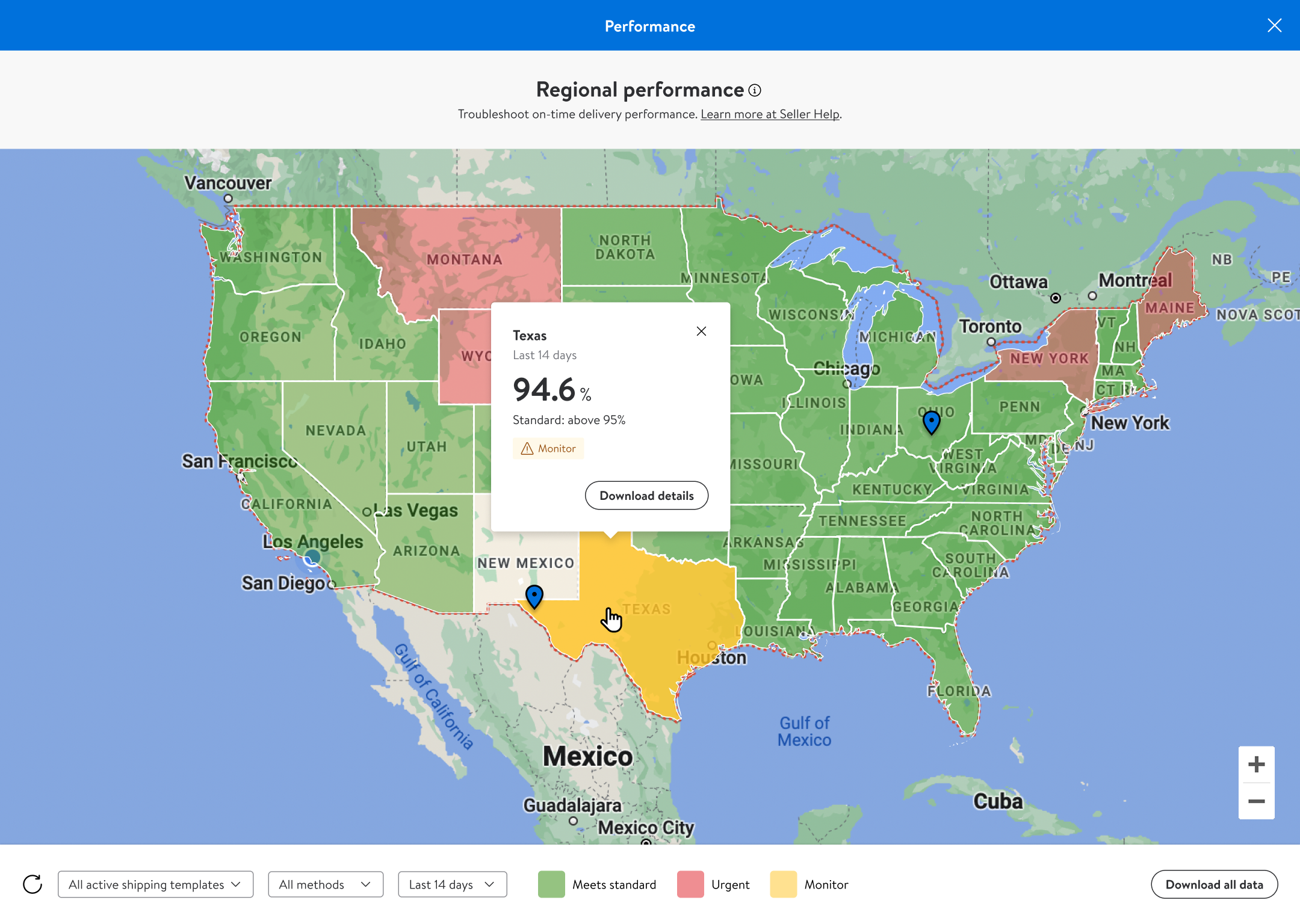
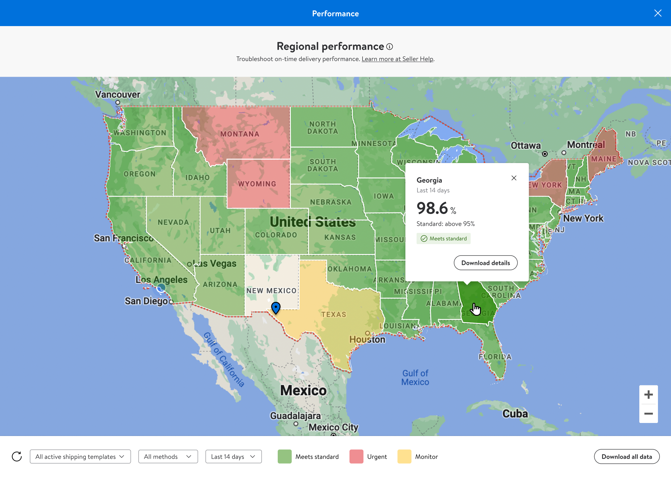
Regional performance — critical state

Fill in the form and I’ll get back to you as soon as possible.
Thanks for reaching out. I’ll get back to you soon.