🔒
Protected case study

Enter the password to view this case study.

Incorrect password — try again.

← Go to homepage
WorkAbout Blog Resume Contact
Back to work
Yahoo
0 to 1 Monetization Commerce Ecosystem

Building Yahoo’s commerce ecosystem from scratch

My RoleUX Lead
Scope0–1 · Research · Ecosystem design
PartnersEng · PM · Research · Legal · Content
ToolsFigma · Sketch · Flinto
TL;DR — The outcome

Phase 1 — Shoppable video module

29%
Homepage revenue share
A single Commerce Module generated nearly a third of Yahoo’s total commerce revenue
200%
YOY revenue growth
Year-over-year revenue increase across the commerce ecosystem as of 2023
73%
More sales YOY
Increase in sales compared to the same holiday period the previous year
5/5
Q1 goals exceeded
Exceeded every Q1 2020 target: editorial adoption, DAU, time spent, engagement, and revenue

Yahoo had a massive content audience and zero commerce infrastructure. Across three phases, we built Yahoo’s shoppable content ecosystem from nothing — starting with a scrappy MVP, growing it into a platform, and ultimately creating the conditions for Yahoo Shopping to exist. The work took editorial content from a passive experience to a revenue-generating commerce destination.

The opportunity

Yahoo had a content audience of a billion users. Commerce was an afterthought.

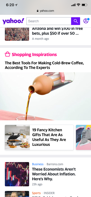
Following the launch of Yahoo Play, the team learned that interactive features meaningfully drive user engagement, retention, and revenue. Yahoo Lifestyle was producing high-quality editorial content — videos and articles featuring products users actually wanted — but the experience stopped there. No way to discover, compare, or buy. The opportunity was hiding in plain sight.

How might we increase user engagement in Yahoo Lifestyle articles and grow commerce revenue using the media formats we already have?

Four problems to solve

Passive consumption
Users didn’t actively interact with content. Engagement and retention dropped as a result — no stickiness, no return intent.
Friction & missed revenue
Yahoo earned little to nothing from third-party product recommendations and missed the opportunity to position itself as an e-commerce destination.
More ads, less MAU
Users saw contextually irrelevant ads, got annoyed, and disengaged. Ad performance suffered alongside user retention.
Editorial limitation
Editors lacked the tools to create rich, interactive content. Every article was a static wall of text and images with no commerce hooks.
Existing Article Page
Passive experience — products featured in content had no path to discovery or purchase
Article page before redesign

Research confirmed the hypothesis

The data backed our direction before we designed a single wireframe.

76%
Enjoy unexpected discovery
Consumers enjoy making unexpected product discoveries while consuming content
2x
Conversion from interactive
Conversion rate for users engaging with interactive content vs. static
85%
Bought after seeing in video
Millennials and Gen Z made a purchase after seeing a product featured in a video
Phase 1
Phase 1 — Shoppable Video

A scrappy MVP that proved the concept

The initial ambition was in-video interactivity — product hotspots that activate as items appear on screen. That would require image recognition and a new product database. Too slow for a hypothesis test. We made a deliberate call: ship fast, limit scope, prove demand. Instead, we designed a synchronized product carousel alongside the video — no new infrastructure required.

Design goals

Early brainstorming

I did some quick brainstorming and generated a few mocks in one afternoon to initiate the conversation with the Product leadership.

Brainstorm 1

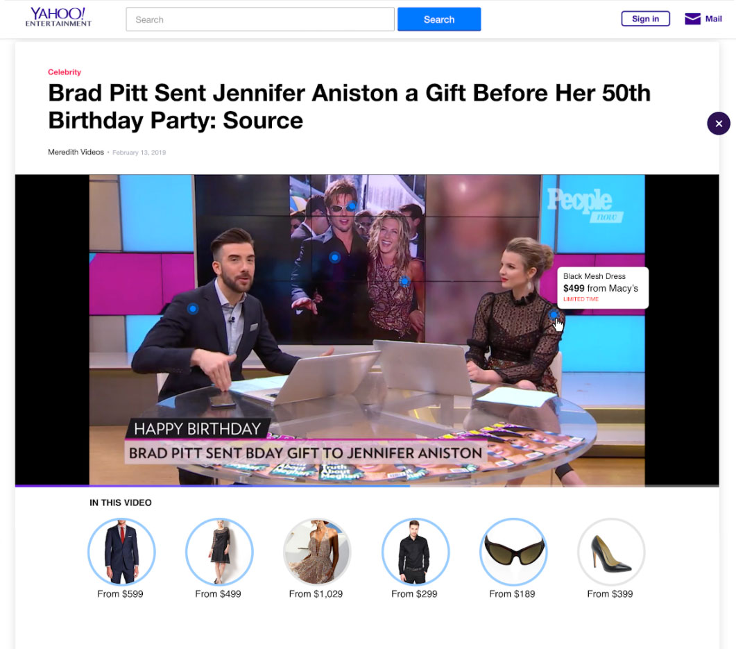
In-video interactivity concept 1

Brainstorm 2

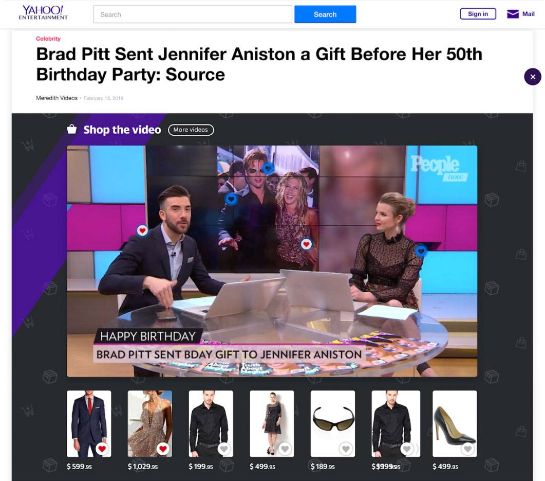
In-video interactivity concept 2

Design explorations

Once the team was onboard, I explored how product tiles could live alongside video content — different layouts, card shapes, and levels of visual prominence.
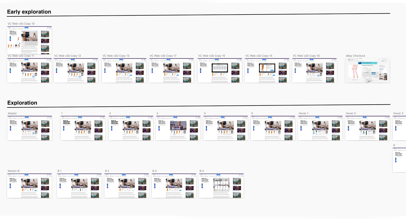
Exploration 1
Exploration 2
Exploration 3
Exploration 4

Exploration 1

User testing

We tested multiple designs with real users. The response was immediate and enthusiastic — and pointed clearly toward showing more products together.

"All the items that she talks about here, you don’t have to hunt and search for it, it’s right here. That’s actually pretty cool!"

"I would love if they were to launch something like this on YouTube. It feels like TV, internet, etc. are becoming integrated."

100% of users said they wanted to see more items together — confirming the grid layout over single-item display

Final design

Shoppable video live

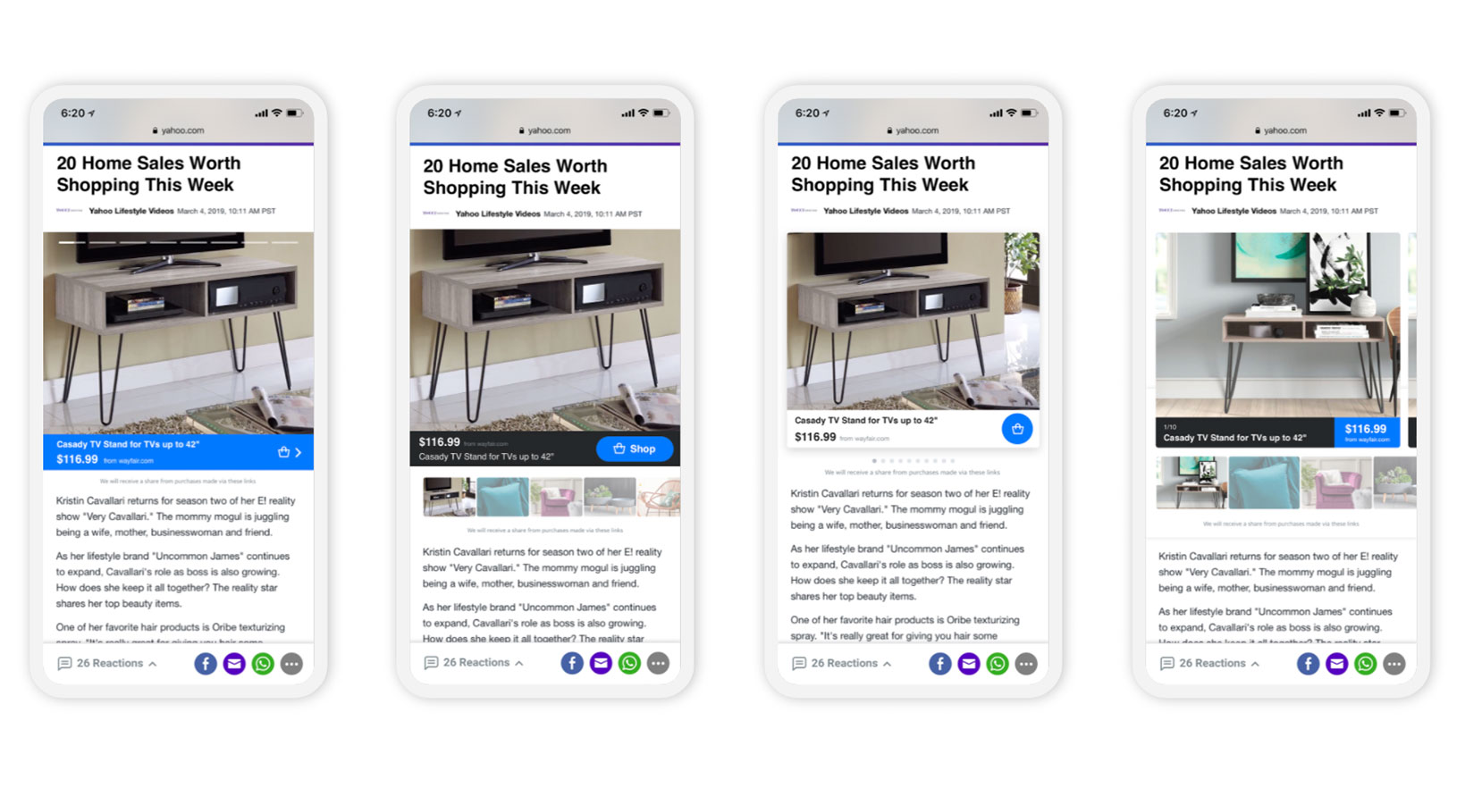
Screen recording from a live article

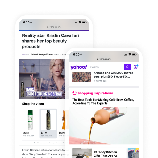
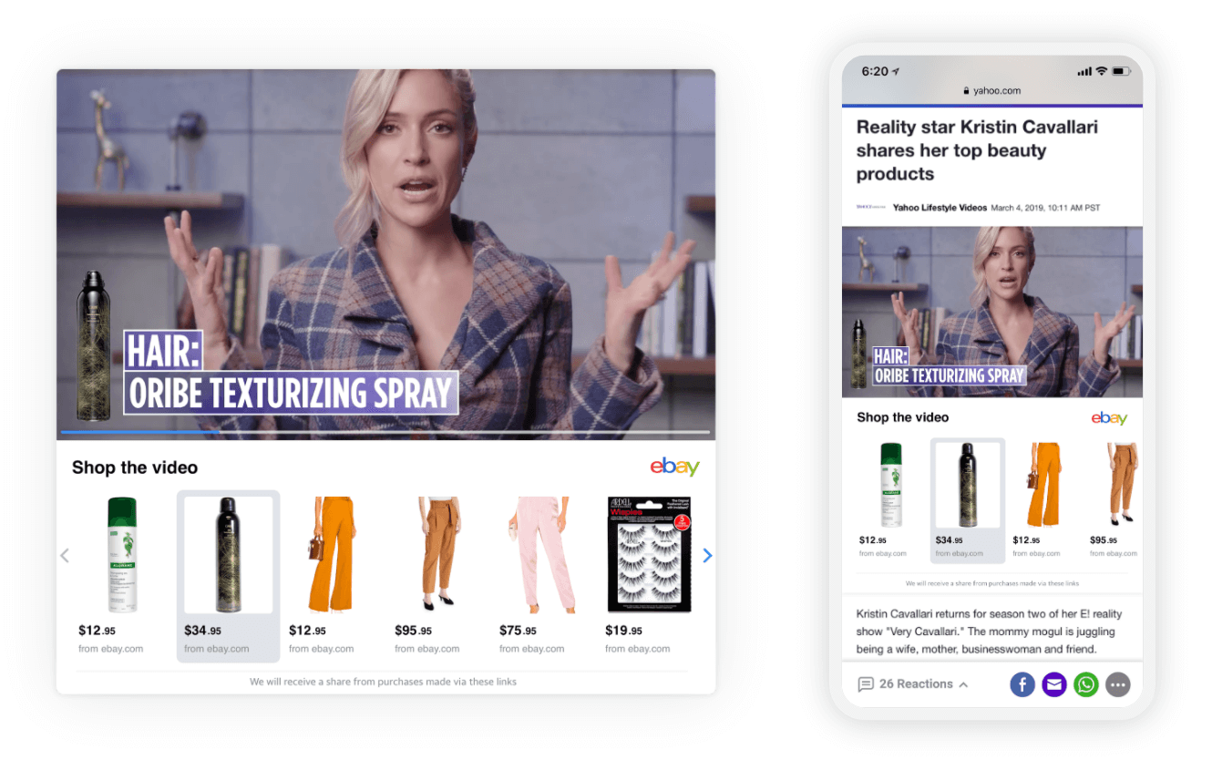
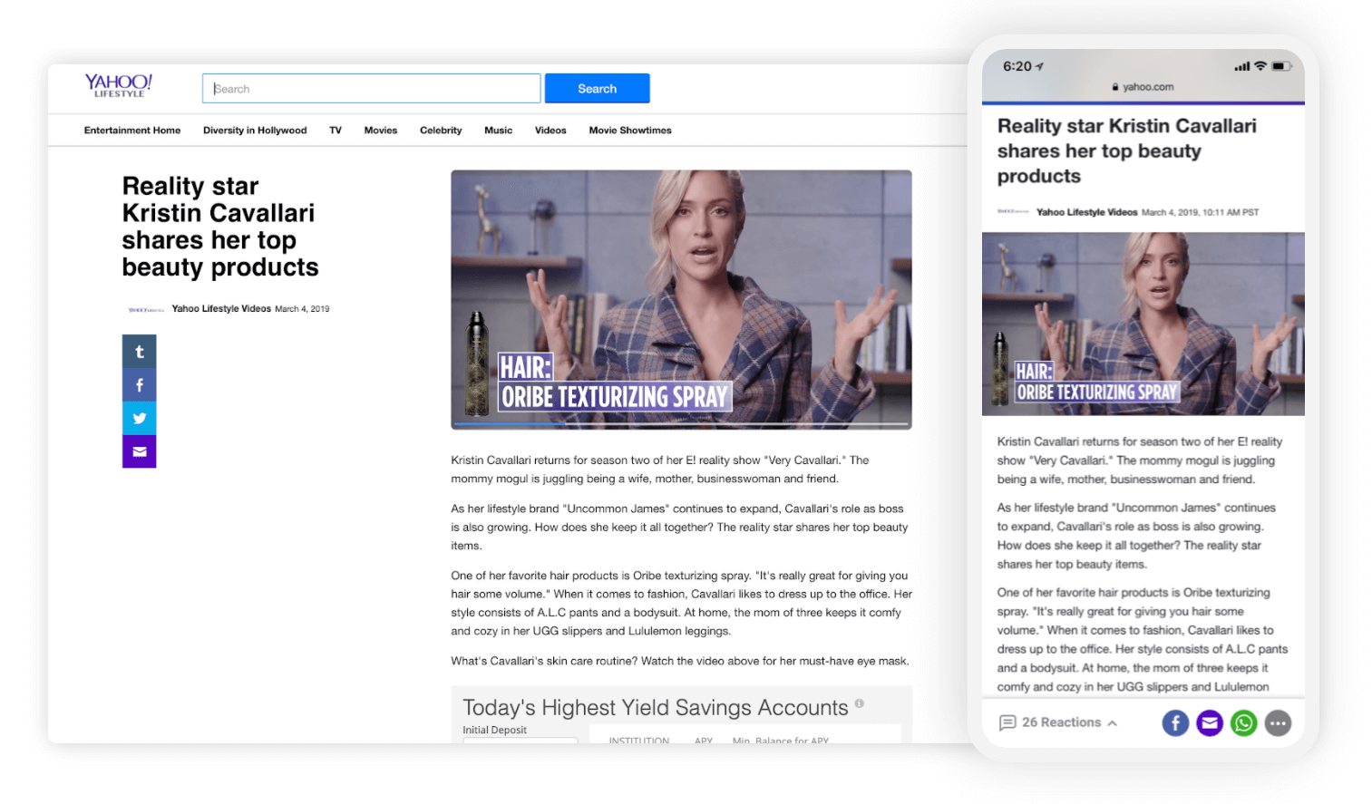
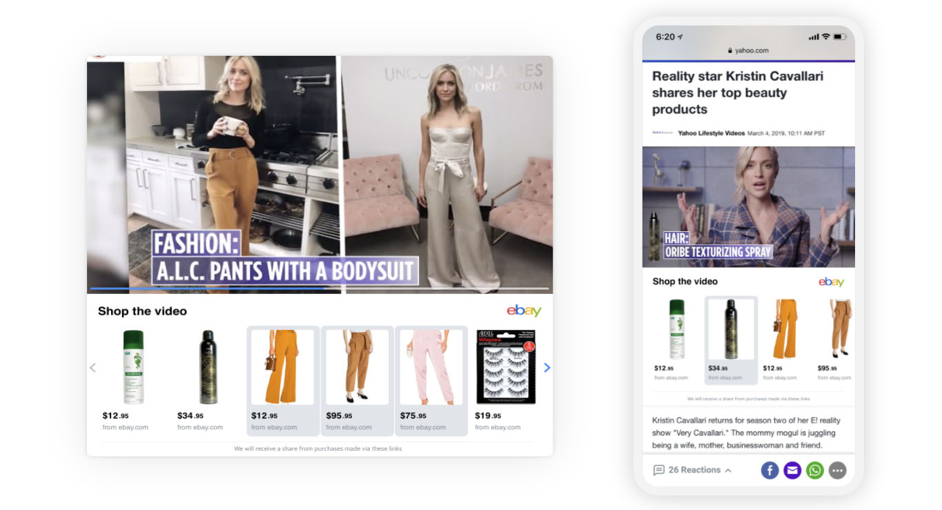
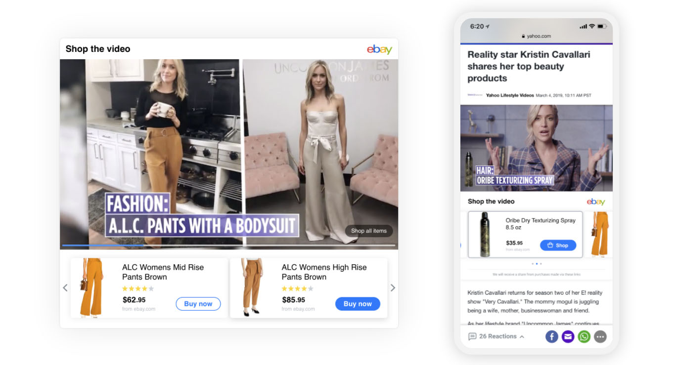
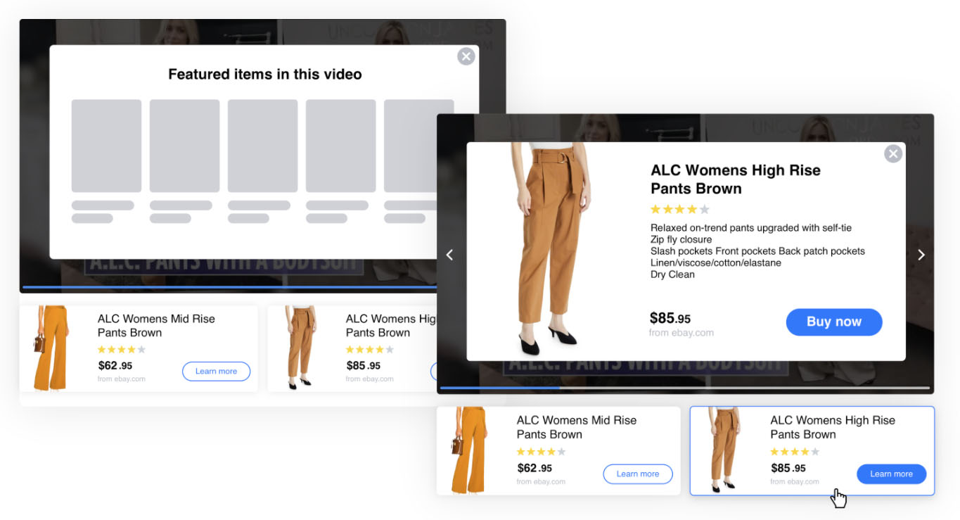
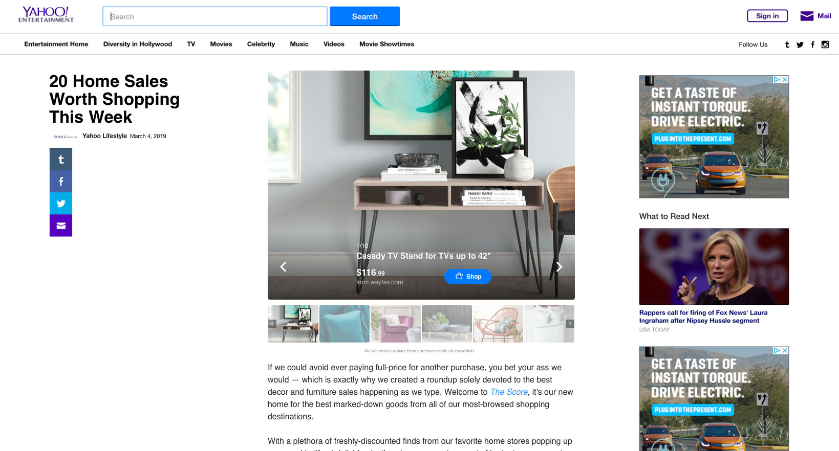
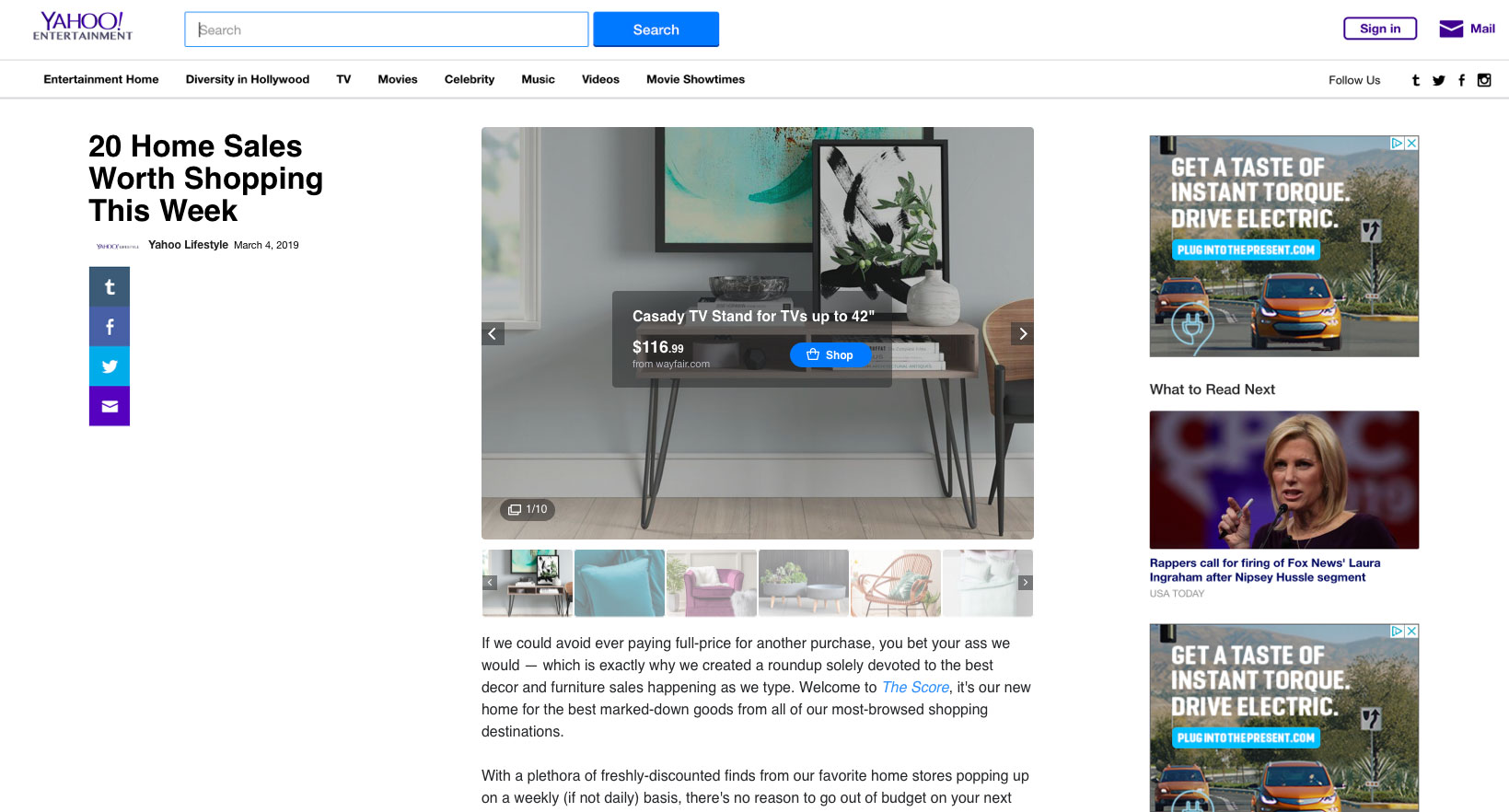
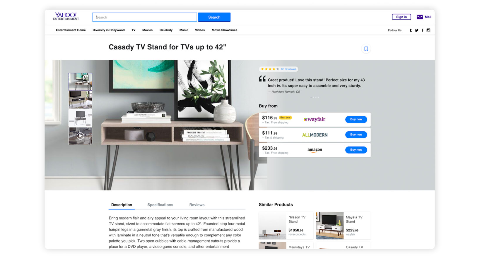
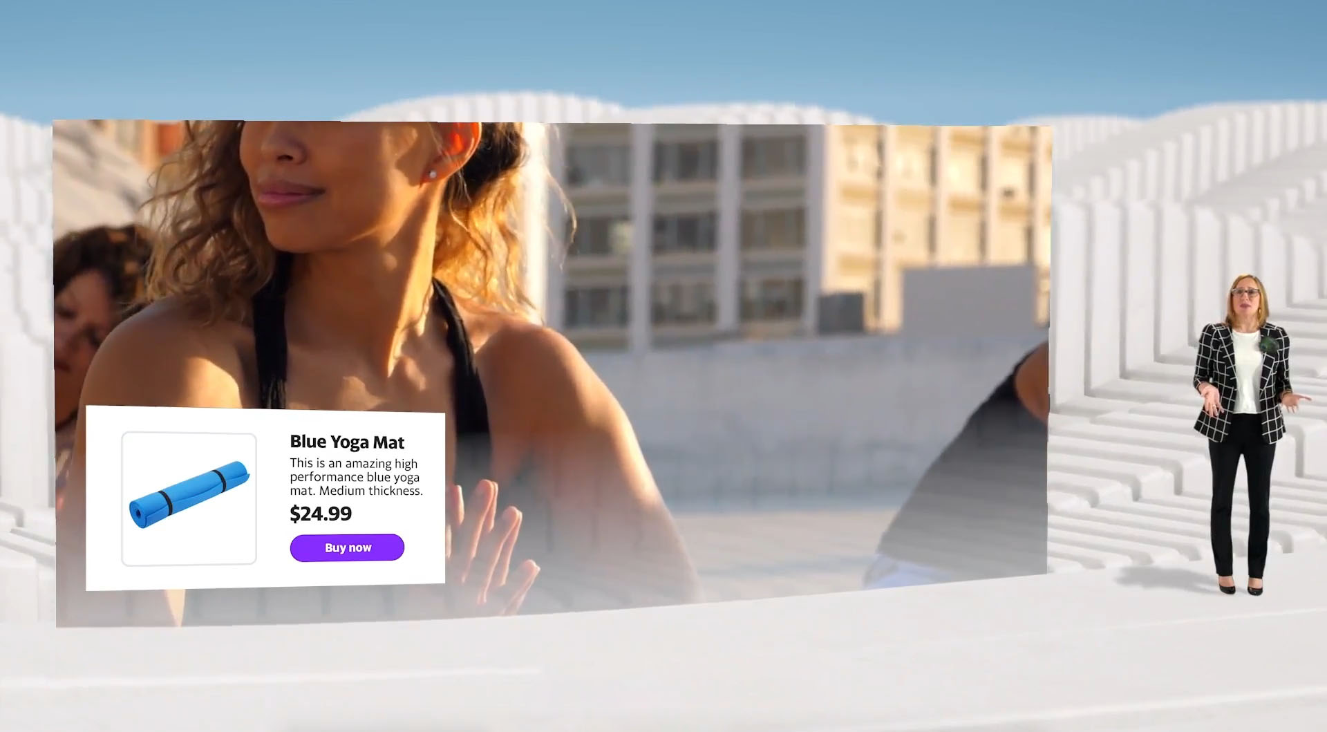
The final design pairs video with a synchronized product carousel. As the video progresses, the corresponding product is highlighted automatically.

  • Products featured in the video and article displayed in a carousel alongside the player
  • As the video progresses, the corresponding product is highlighted in real time
  • Users hover to see product details and click through to the merchant’s page to purchase
  • Yahoo earns a revenue share on each completed purchase
Final shoppable video design

Final design — shoppable video with synchronized product carousel

Soft launch results

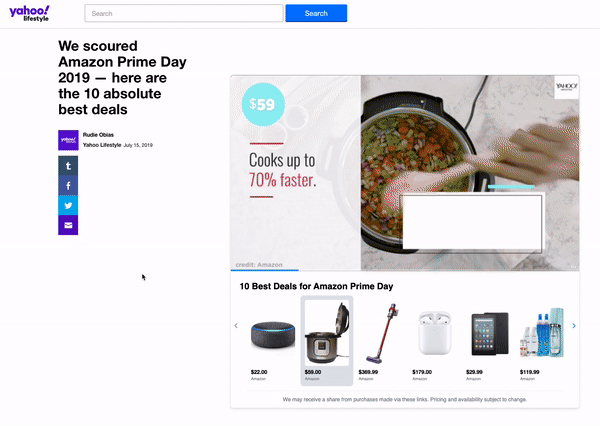
We launched on a single article targeting Amazon Prime Day. One article. The results were extraordinary.

1.1M
Impressions
On Amazon Prime Day from a single shoppable article
$170k
In sales
USD in sales from the US alone from one module in one article
7%
Affiliate revenue share
Of Yahoo’s total media affiliate commerce revenue from a single module
PM message about results

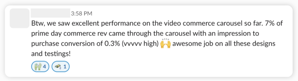
The PM’s message to the team after seeing the results

Phase 2
Phase 2 — Article Optimization

Extending commerce beyond video

The shoppable video success opened the door to a bigger question: how do we bring this to image-based articles and build a richer product discovery experience? I explored shoppable image carousels and a dedicated product detail and comparison page — giving users deeper research tools within Yahoo.

Image article v1.1
Image article v1.2
Image article v1.1 alt
Product detail v1
Product detail v2

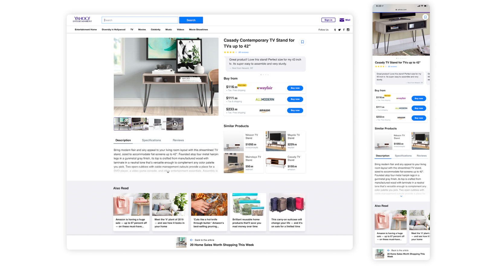
Shoppable image article exploration

Fireplace — a platform is born

The success of our experiments gave birth to Fireplace — a full suite of editorial tools empowering Yahoo editors to add interactivity to any content format, not just commerce. I collaborated with another designer to build the editor-side platform. Fireplace and shoppable content got featured at company-wide events, was promoted across all internal screens, and became a core part of Yahoo’s product strategy.

Fireplace on company screens

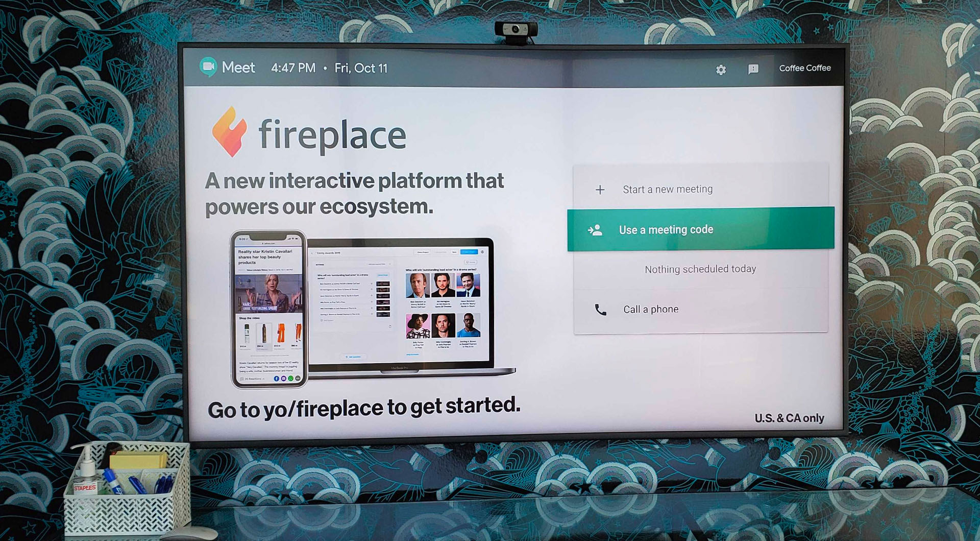
Shoppable content featured across company screens

Presenting at company event

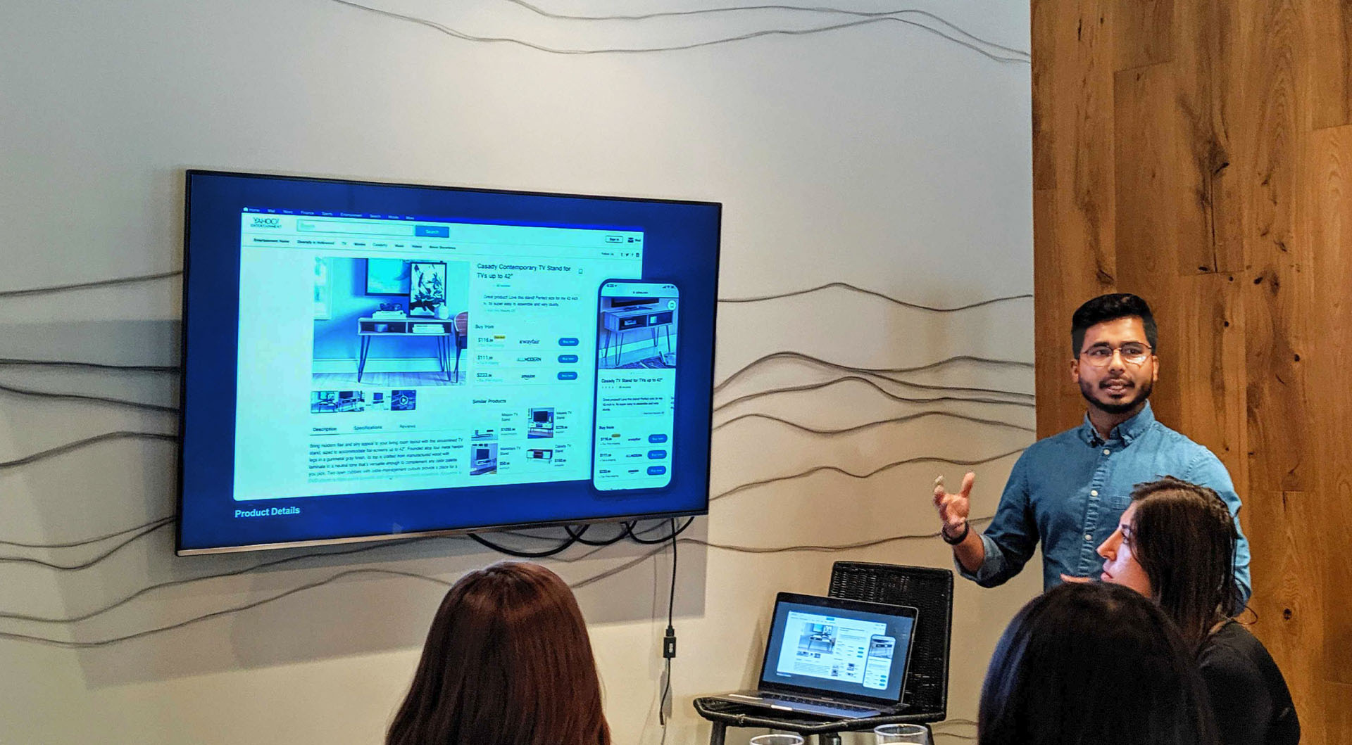
Presenting at a company event

Featured in Yahoo Commerce Strategy 2021

Featured in Yahoo Commerce Strategy

Four months later — Goals exceeded across the board

The team set ambitious Q1 targets. We didn’t just hit them — we exceeded every single one, often by mid-quarter.

+340%
Editorial adoption
85 articles/week using Fireplace by end of quarter (goal was 19/week)
+10%
Engagement
3% above goal by mid-quarter (goal was +7%)
+14%
Time spent
9% above goal by mid-quarter (goal was +5%)
+150%
YOY revenue
Revenue grew 150% year-over-year, expanding from US/Canada to 11 countries
Phase 3
Phase 3 — Homepage Commerce Discovery

Making Yahoo’s most-visited page a commerce destination

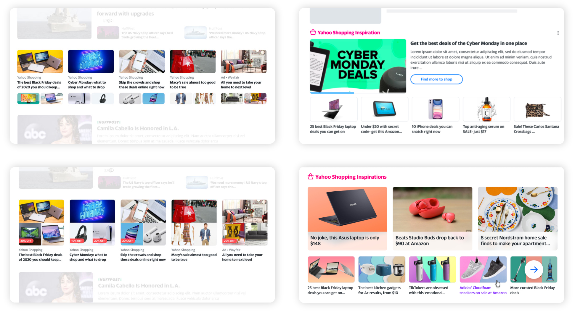
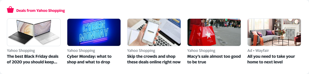
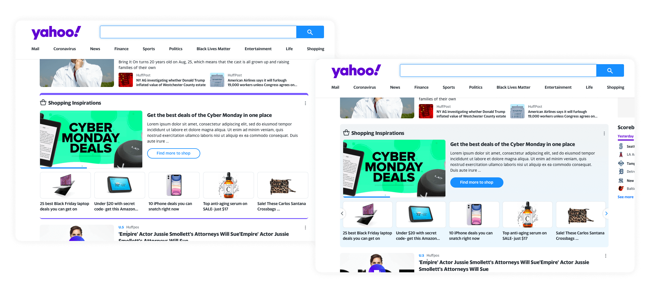
Yahoo’s homepage received massive traffic, but commerce was still under-optimized. Revenue was tied to the volatile news cycle: if a major news story bumped shopping content off the homepage stream, revenue dropped. We needed a dedicated, permanent placement that users could learn to rely on for deals.

How might we expand commerce across the Yahoo ecosystem and help users see Yahoo as a destination to find the best deals — without relying on the news cycle?

The problem with the existing approach

Before: Shopping articles lost in the news stream
No dedicated placement — shopping content sat next to truck crash news, easily missed, no way to find more deals
Before commerce module

Design explorations

I explored a wide range of visual treatments — from aggressive distinction to subtle — to give the Commerce Module its own identity within the homepage stream. I worked closely with the Homepage Design team and engineering to stay within layout and technical constraints.

Design explorations

Desktop design explorations

The failed MVP — and what it taught us

Technical constraints meant pulling multiple images per article wasn’t possible for MVP. We shipped a single-image version with a section title. CTR wasn’t strong enough. Rather than accepting it, we went back with clearer principles: make it bigger, lead with a hero image, add a CTA to the shopping hub, and advise editorial to use clean product photography.

Failed MVP — single image per article
Didn’t stand out enough from the news stream — CTR below target
Failed MVP

Final desktop design

Iteration explorations

Iteration explorations based on revised design principles

Final desktop design

Final desktop design — clean, minimal visual noise, achieved CTR goal when tested

Mobile design

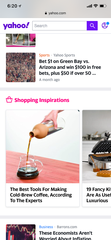
I designed two mobile variants for bucket testing. Both used edge-to-edge imagery and a CTA to the shopping hub. Design 1 — featuring hero image + small card carousel — won decisively.

Design 1 — Winner

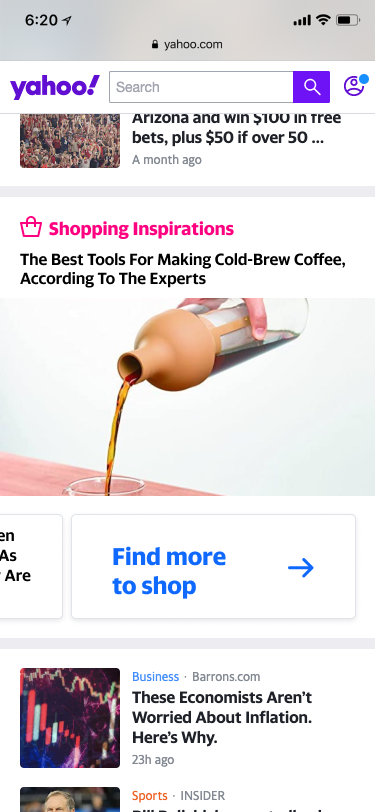
Hero + small card carousel + CTA — 4.78% CTR

Design 2

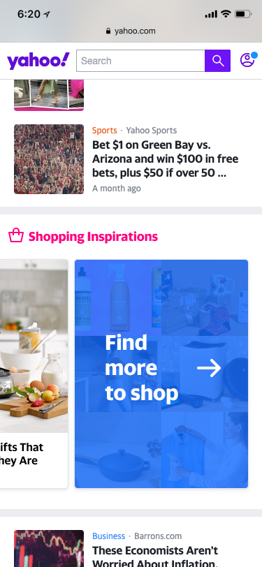
Equal-size card carousel — 3.77% CTR

Phase 3 results

29%
Homepage revenue share
Single module generated nearly a third of all Yahoo commerce revenue
6.7%
Desktop CTR
User-based click-through on the Commerce Module — well above benchmark
4.8%
Mobile CTR
Design 1 winning variant, tested during holiday season when shoppers are most active
+200%
YOY revenue increase
Year-over-year revenue growth across the commerce ecosystem
+73%
More sales YOY
More sales compared to the same holiday period the previous year
🏪
Yahoo Shopping was created

The commerce ecosystem we built ultimately led to the creation of Yahoo Shopping — a dedicated shopping deals destination. From zero commerce infrastructure to millions in revenue and a standalone product, the journey was complete: editors had powerful tools, users had a frictionless experience, and the company had a new revenue stream.

Reflection

What this project taught me

💡
What I learned
  • Involving engineers early surfaces technical constraints fast — and successful products can absolutely be designed within them
  • Products built on data-backed hypotheses have far greater potential for measurable success than those built on assumptions
  • It’s possible to serve user needs and business needs simultaneously without trade-offs — when the design is genuinely additive
  • A little interactivity goes a long way. When the right tool meets the right moment, users engage enthusiastically and the business wins too
🔭
What I’d do next
  • Invest in ML/AI to enable true in-video product recognition — the original vision deferred for MVP that would eliminate the editorial tagging step entirely
  • Utilize behavioural data to personalise the commerce experience: surface products based on reading history and past purchase interactions
  • Build on the Yahoo Shop foundation with a dedicated commerce destination that goes beyond module placements and becomes a first-class product surface
Yahoo Play Onboarding
Next case study
Yahoo Play Onboarding
View project ⟶
Get in touch
Let’s build something great.

Fill in the form and I’ll get back to you as soon as possible.

Message sent!

Thanks for reaching out. I’ll get back to you soon.